Tilde
Tilde is a brand of “aguas frescas” and natural cold press juices that exists to take care of us from the inside out. It does not compromise on the quality of the ingredients or the cost of the processes in order to offer consumers the intact nutrients of the products that the earth gives us.
Scope:
Brand Strategy
Naming
Branding
Product Design
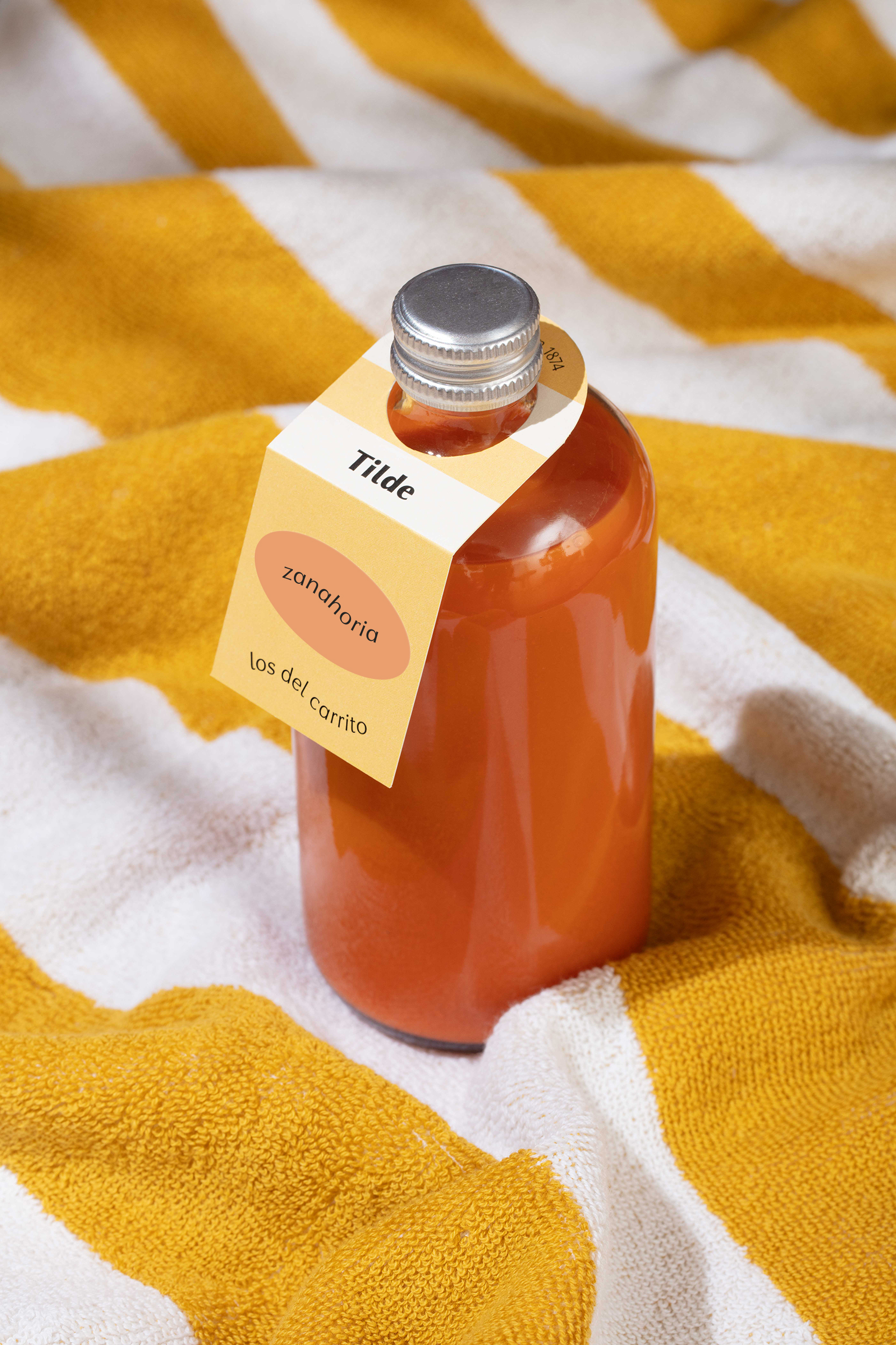
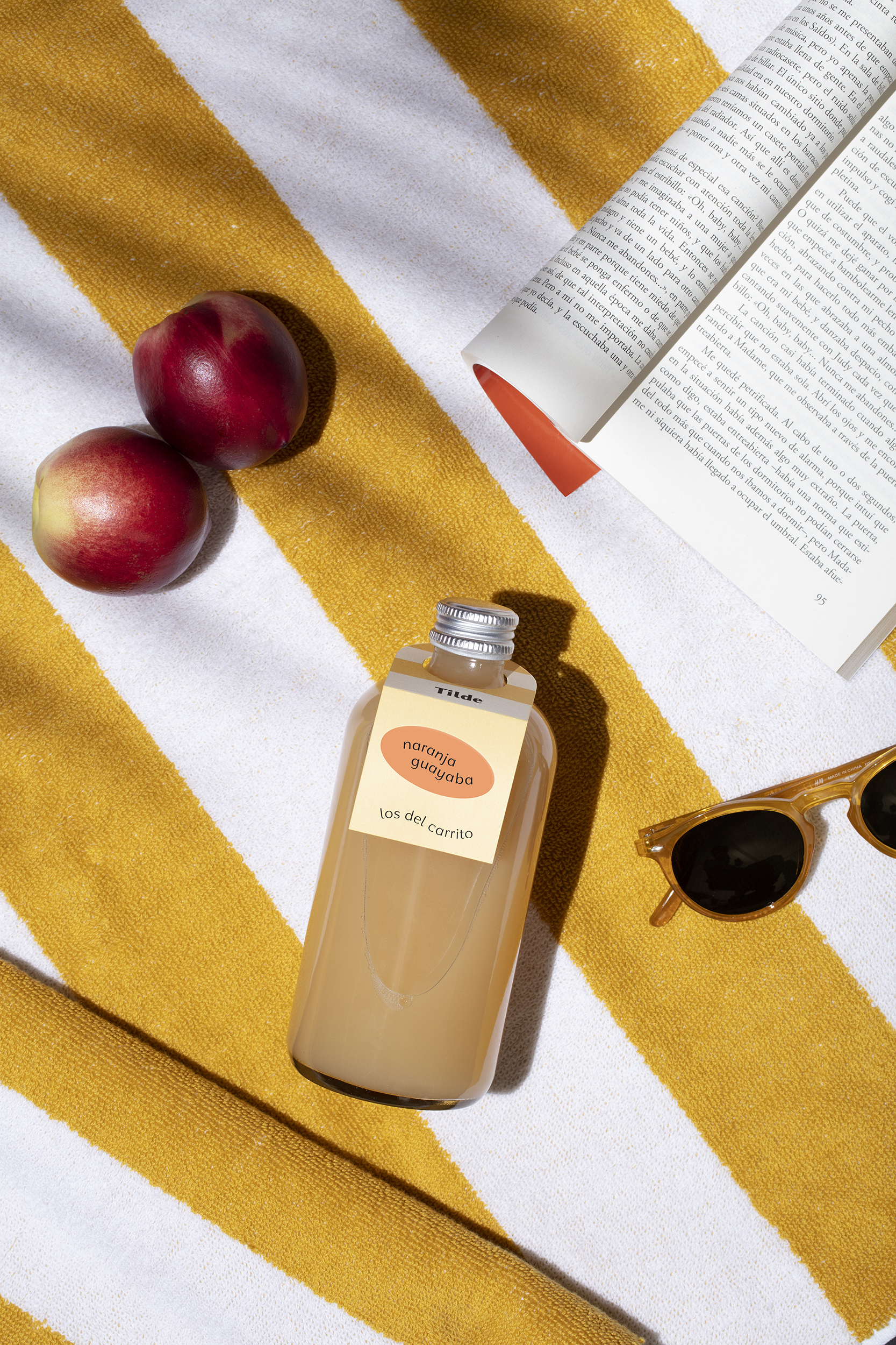
Our graphic concept focuses on the feeling of summer, those moments when the sun shines high and we crave something refreshing. These are also the moments when we naturally crave lighter foods as our body does not require so many calories to survive. Moments when we enjoy life more and want to look and feel healthier.
Tilde is summer all year round.
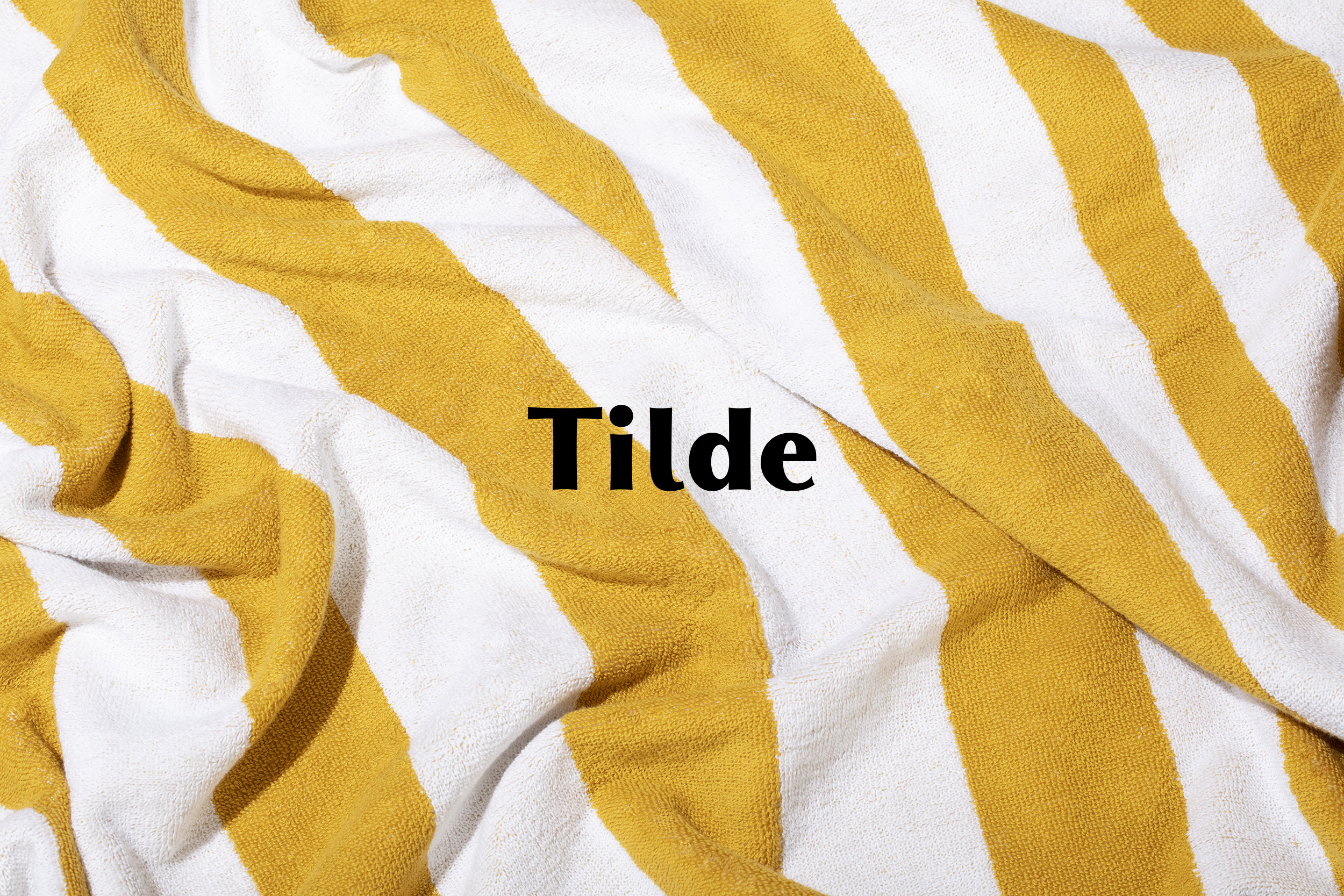
Naming
Tilde is a product of Frida Chilaquiles, a famous restaurant located in Monterrey with several successful branches. We wanted to keep the same concept without being obvious. The name comes from the nickname of Frida Kahlo’s mother, whose full name is Matilde Calderón y González. Tilde is a tribute to Mexican moms who are very protective and loving.
"El carrito"
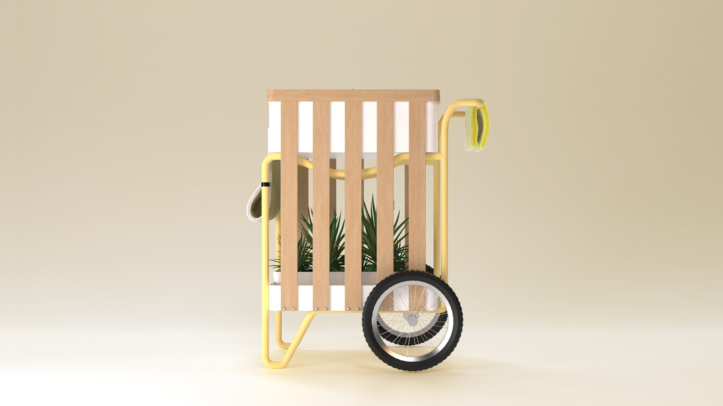
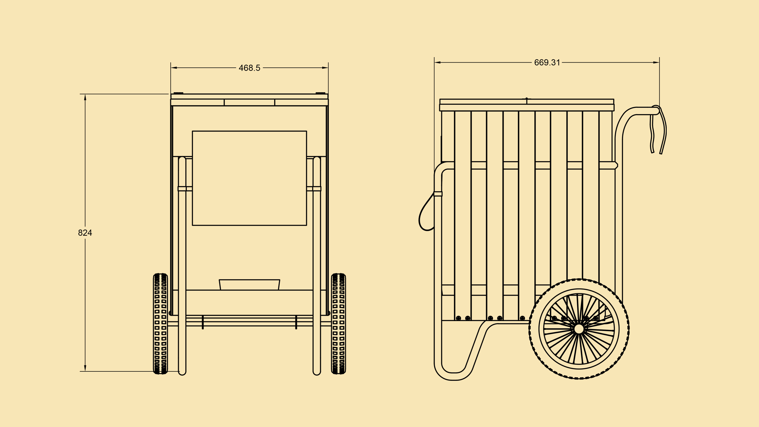
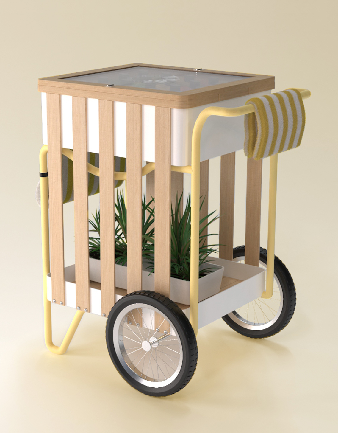
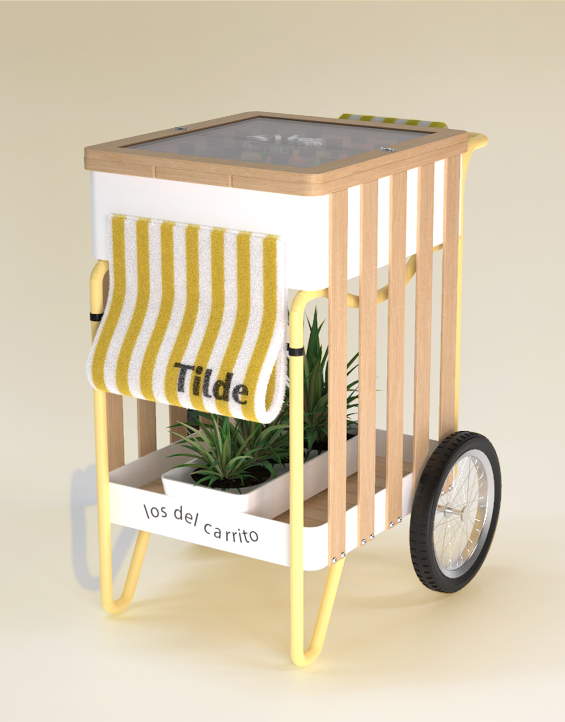
The cart is a primordial part of the brand, as it moves among the tables of the restaurants offering the products on ice so that they do not lose their freshness. Its design is inspired by the furniture we commonly see on the beaches of Mexico. The umbrellas with colorful stripes, the wooden lounge chairs, the Acapulco chairs, the hotel towels and the vegetation provide shade and freshness.
As we have ice on top, we use the water that drains to water the plants below.
Tagline
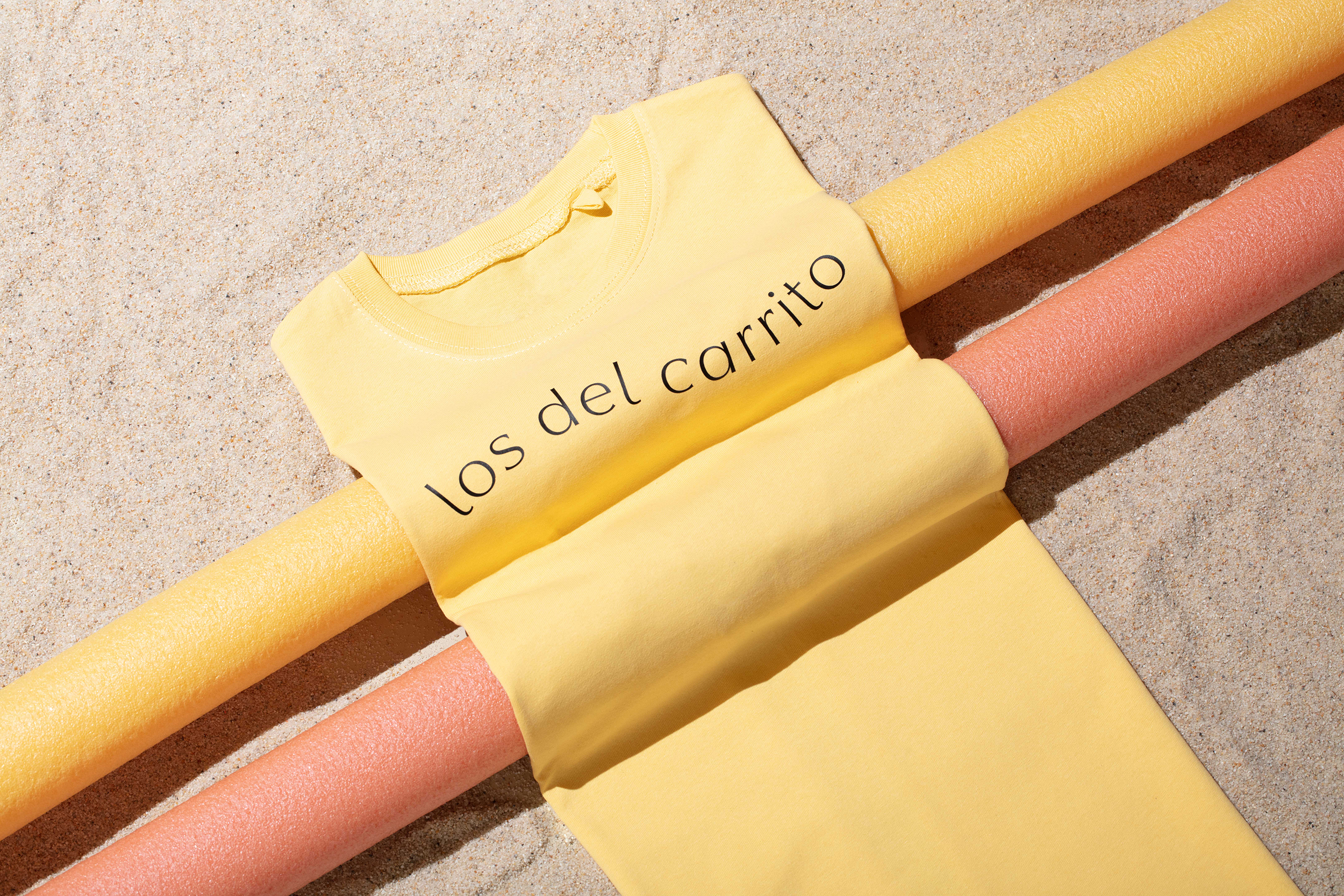
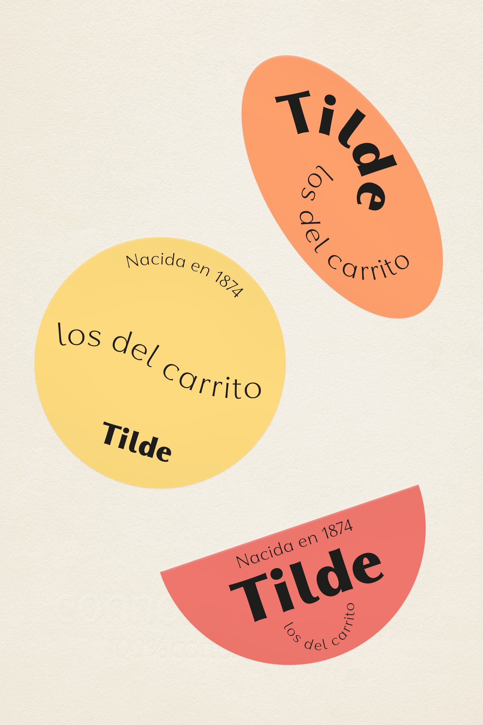
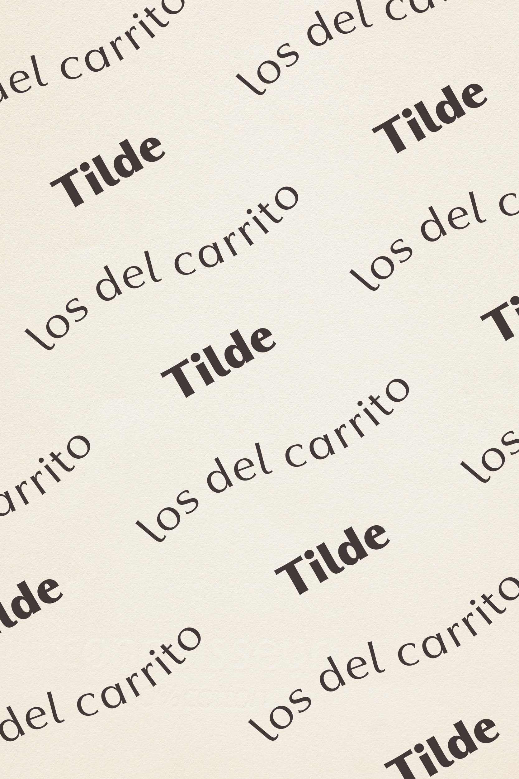
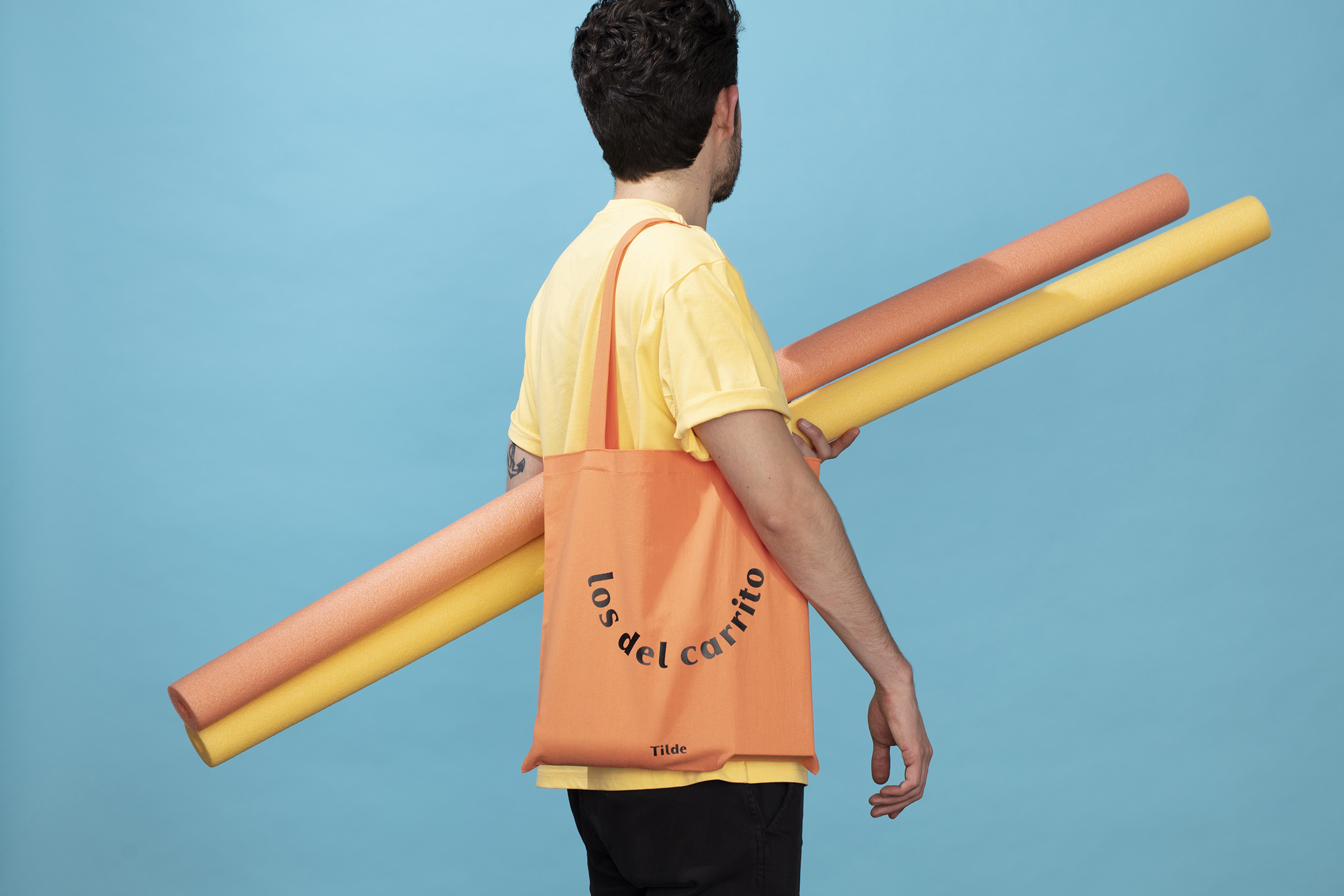
The tagline “los del carrito” that literally means – those from the cart – is a very important part of the identity since the objective of the Tilde brand is to be recognised by the cart first, reason why the packaging design is very minimal.
Graphically we designed it in two ways, as a wave, to refer to the sea and as a smile, for the pleasure that summer and vacations give us.
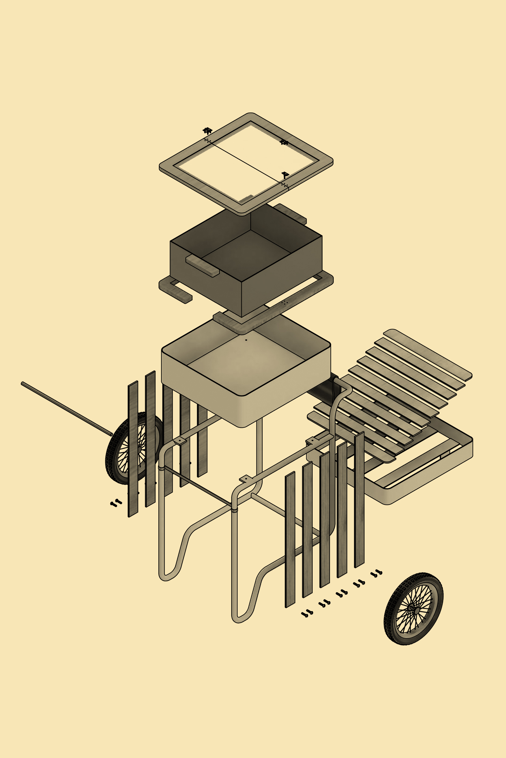
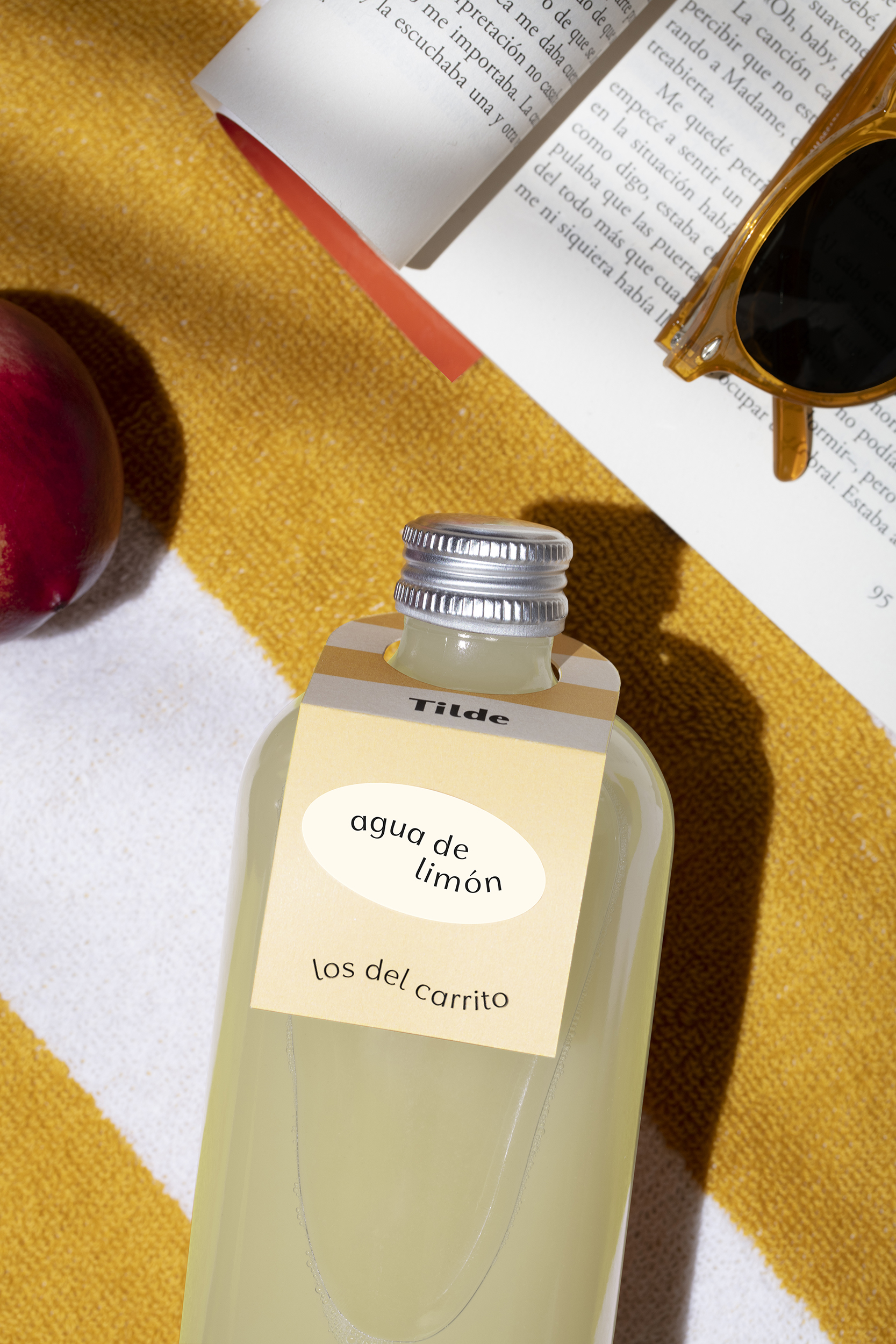
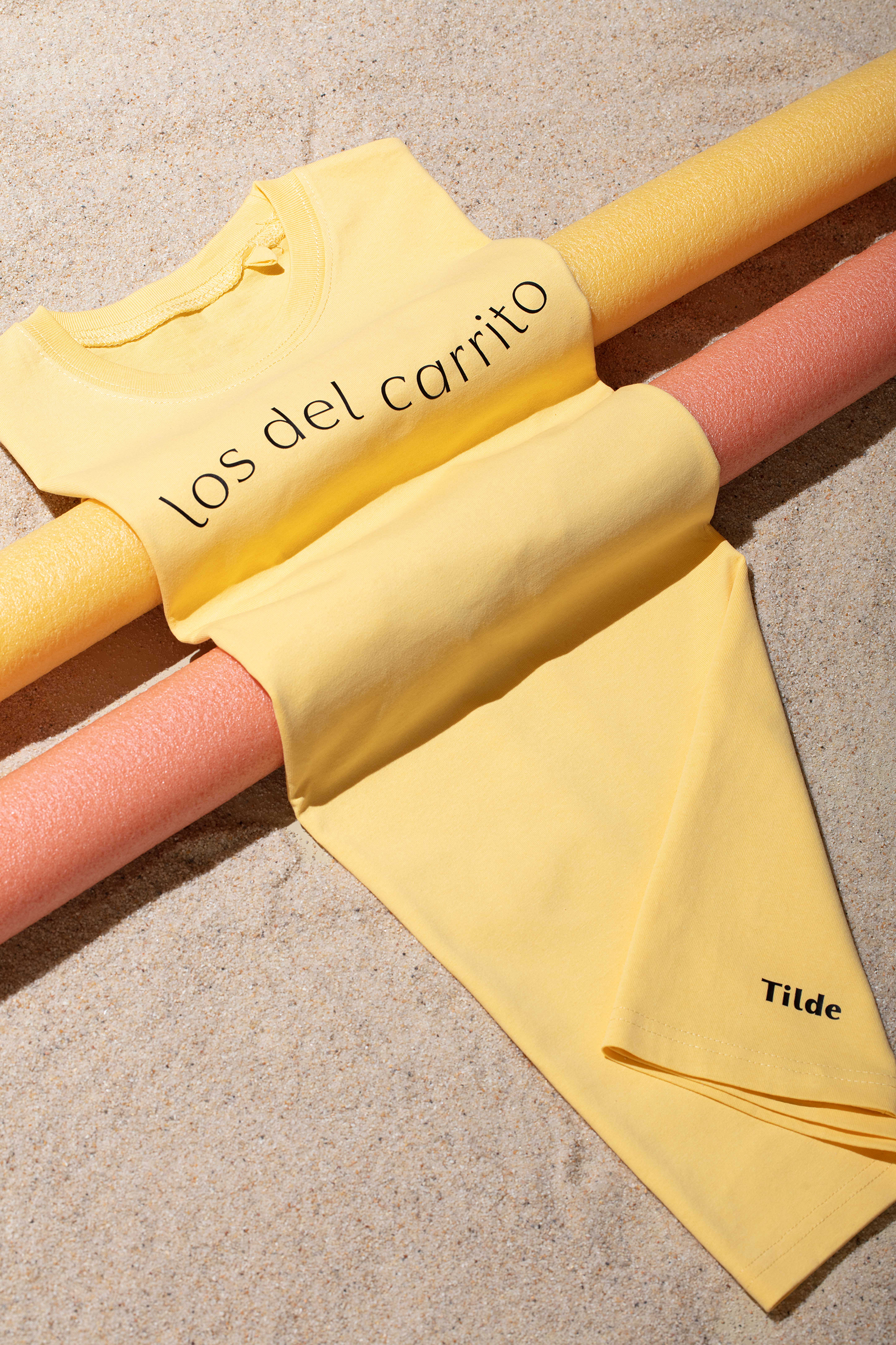
Product design, Renders & Drawings by Luis Amaya.
Photos by C129.