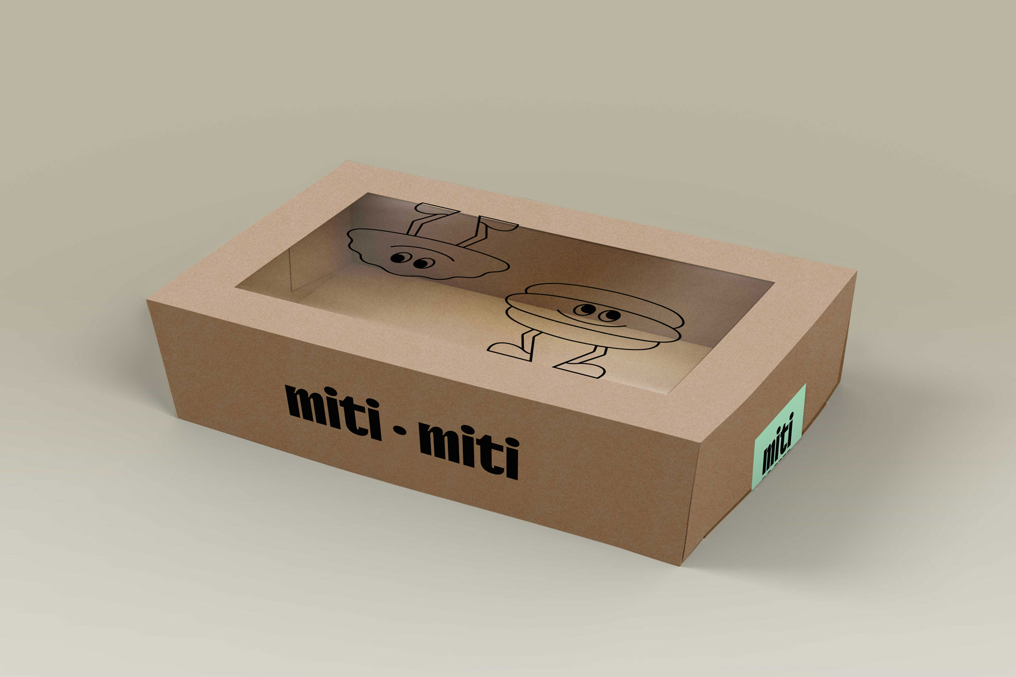
Miti Miti
Miti Miti is a brand of Argentine empanadas located in South Australia. It started in 2021 as a project made with a lot of love by a couple who wanted to offer a product that encapsulated their Latin culture, and that’s how they decided to focus on empanadas, as it is a food that reminds us of relaxed gatherings with friends and family.
Scope:
Branding
Collateral Design
As a culinary concept, everything is completely handmade and made with local products, and they had even created their own preliminary branding to get started. Later they commissioned us to do the rebranding. After an in-depth interview, we detected that the project was very personal and special for them, their intention was never merely commercial, but to create something that was an extension of their own family. They told us that what most identifies and inspires them is sharing. From this concept comes the name, which is an expression used in Argentina and Colombia (where each of them are from) that means half and half.
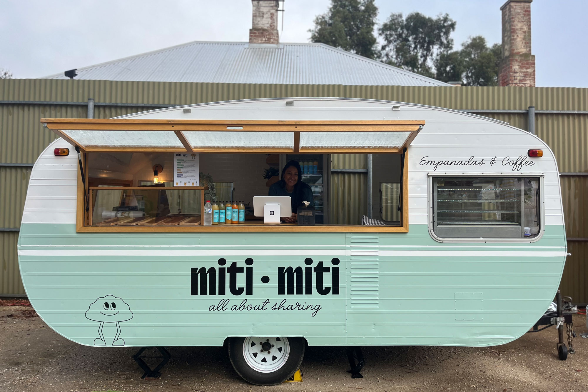
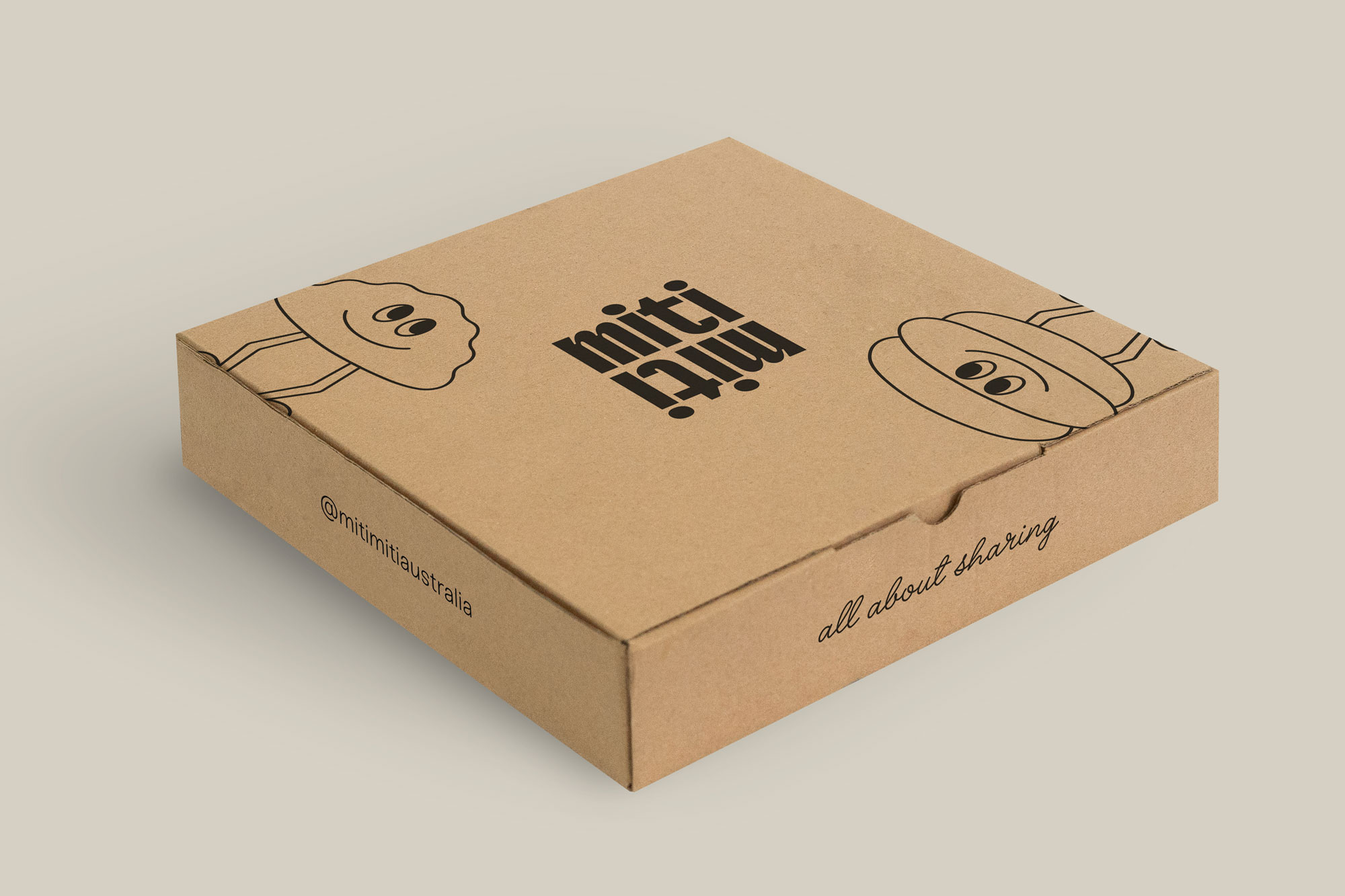
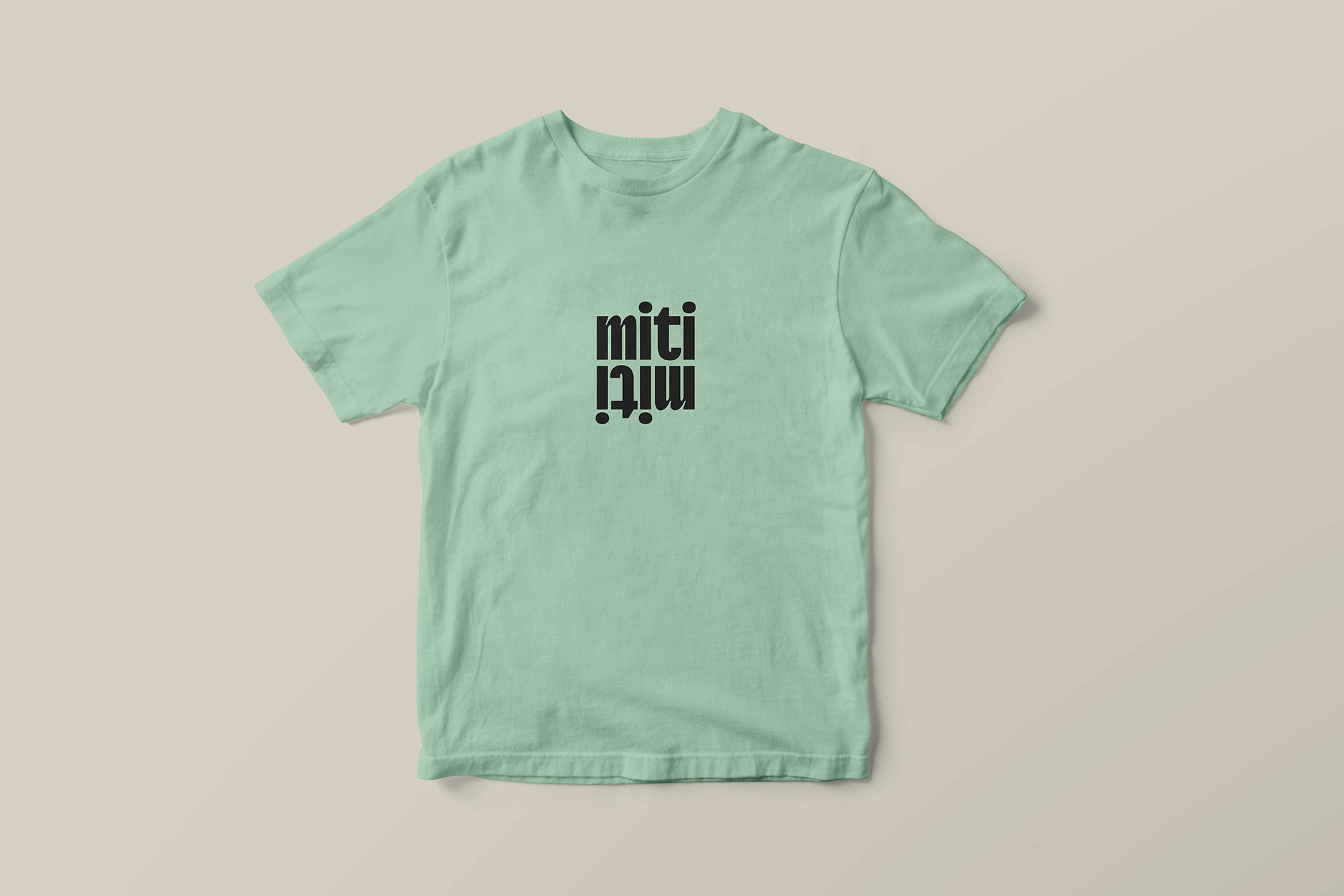


Our graphic proposal seeks to convey this warmth through gestures and typographic selection, color palette and of course the characters that work to clarify what Miti Miti is about and allow us to dispense with a descriptive tagline and instead use “all about sharing”. Something important we were also looking to convey was multiculturalism, moving away from being a brand by Latinos for Latinos and instead being inclusive of all nationalities. The illustrations work to quickly explain what an empanada is like and what it is eaten with… and what do they mean when they say choripán? 🙂
Animations by Victor González
