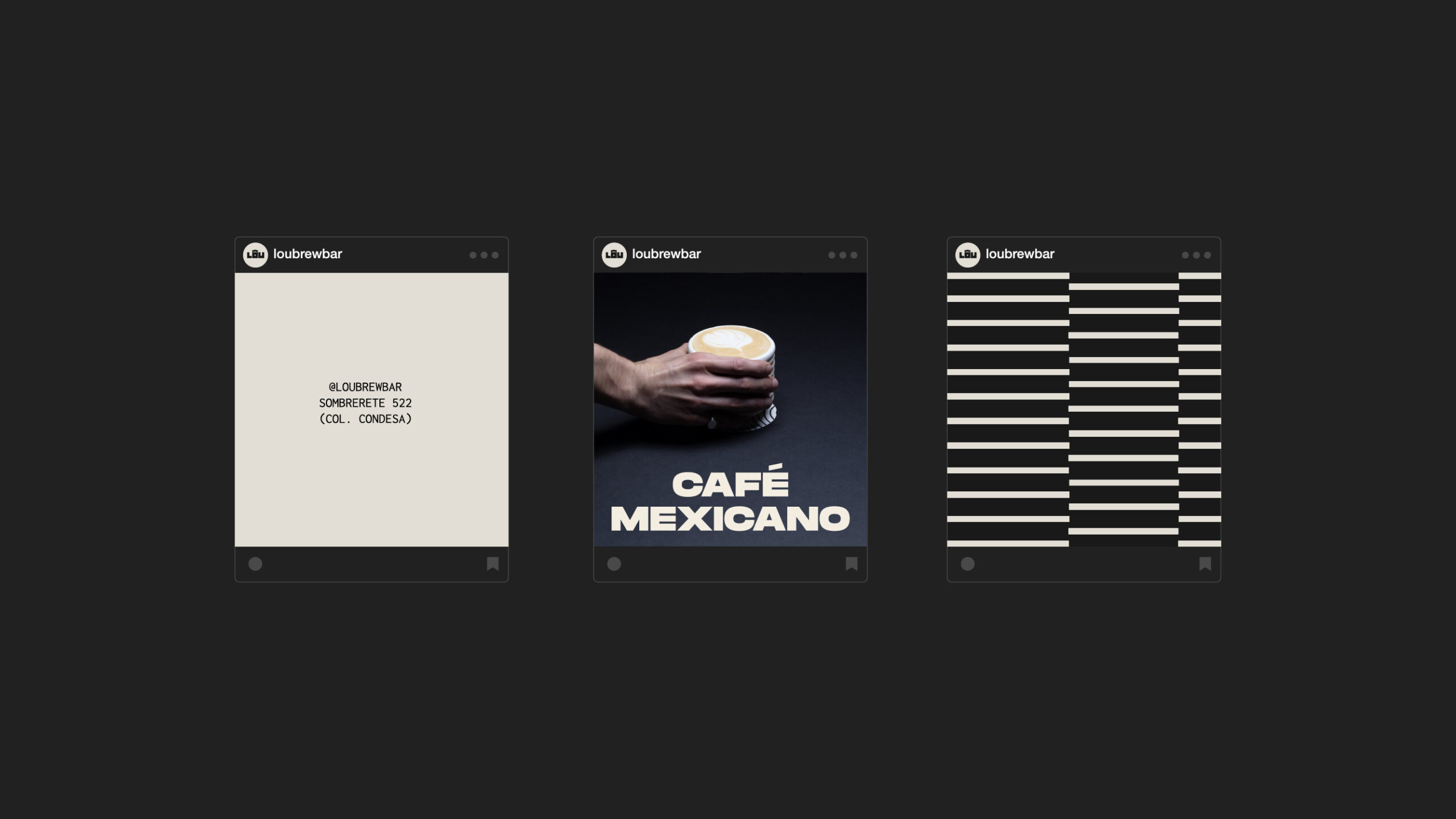
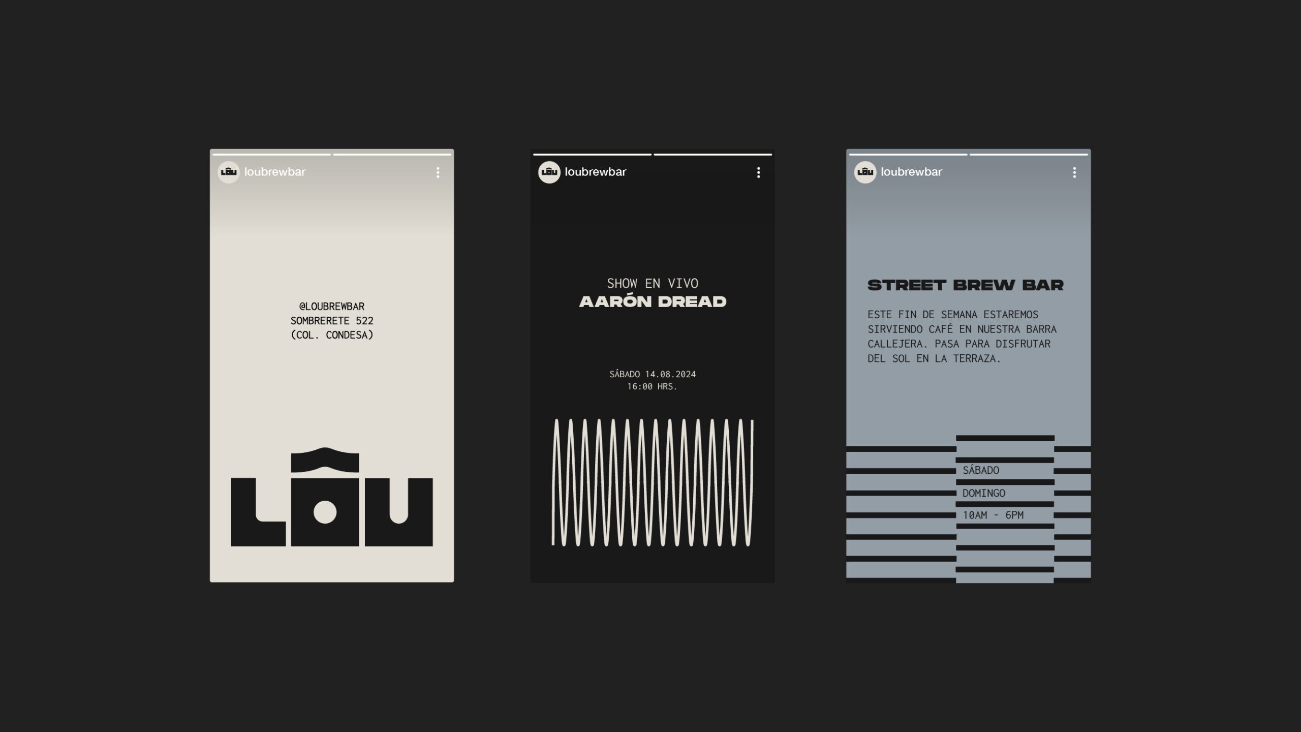
LÔU
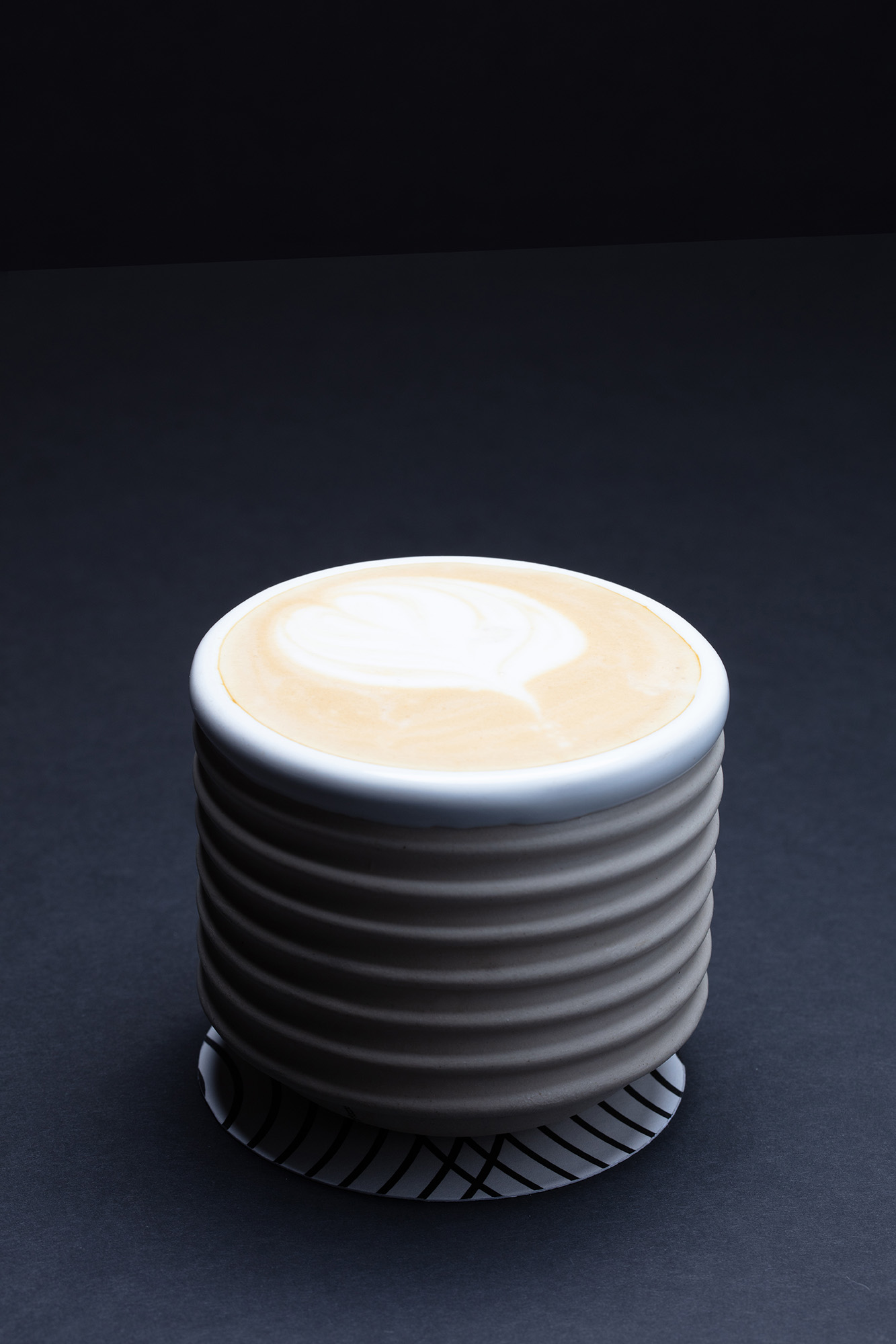
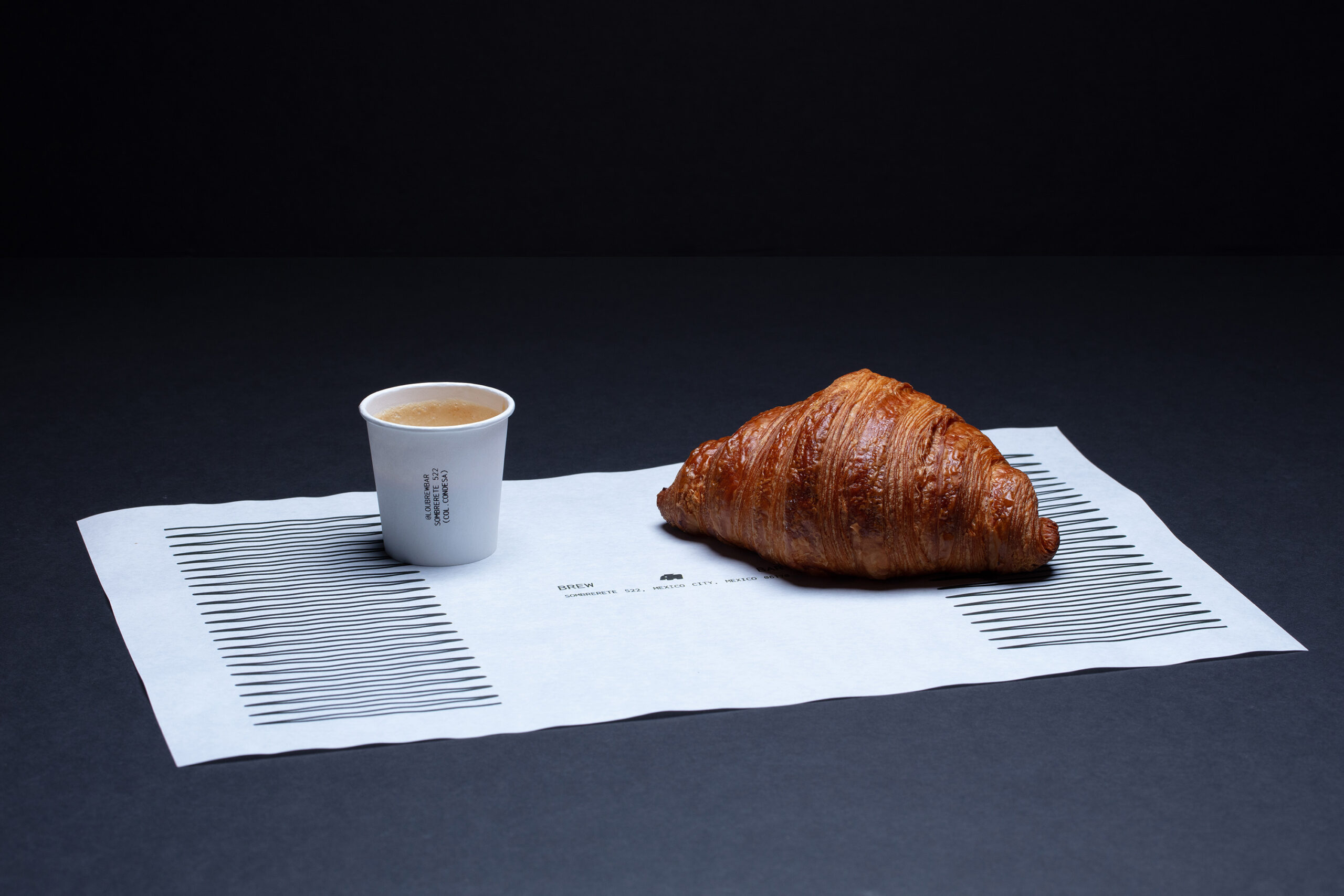
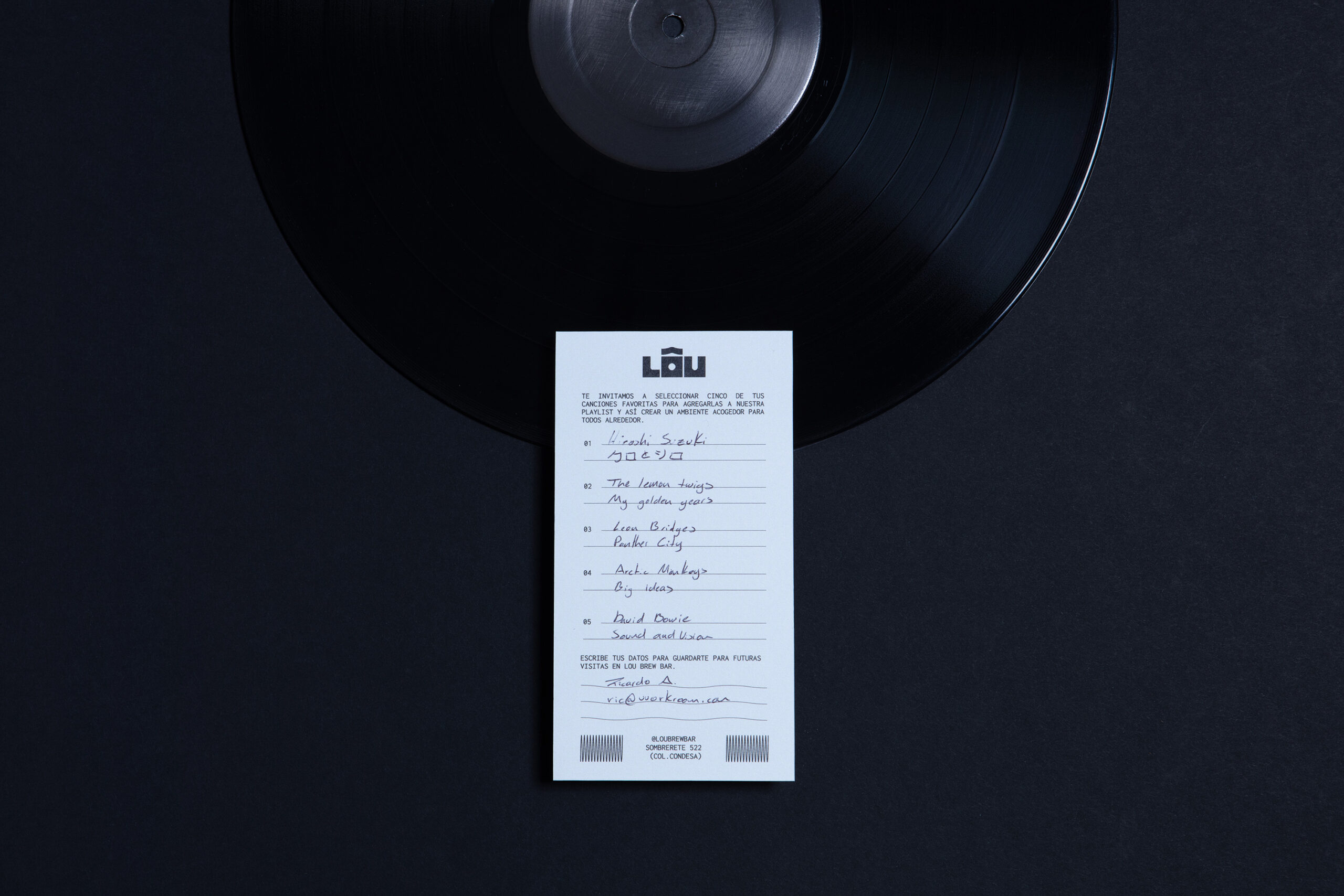
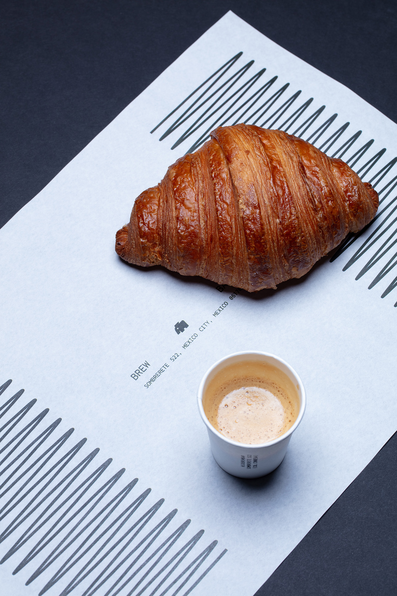
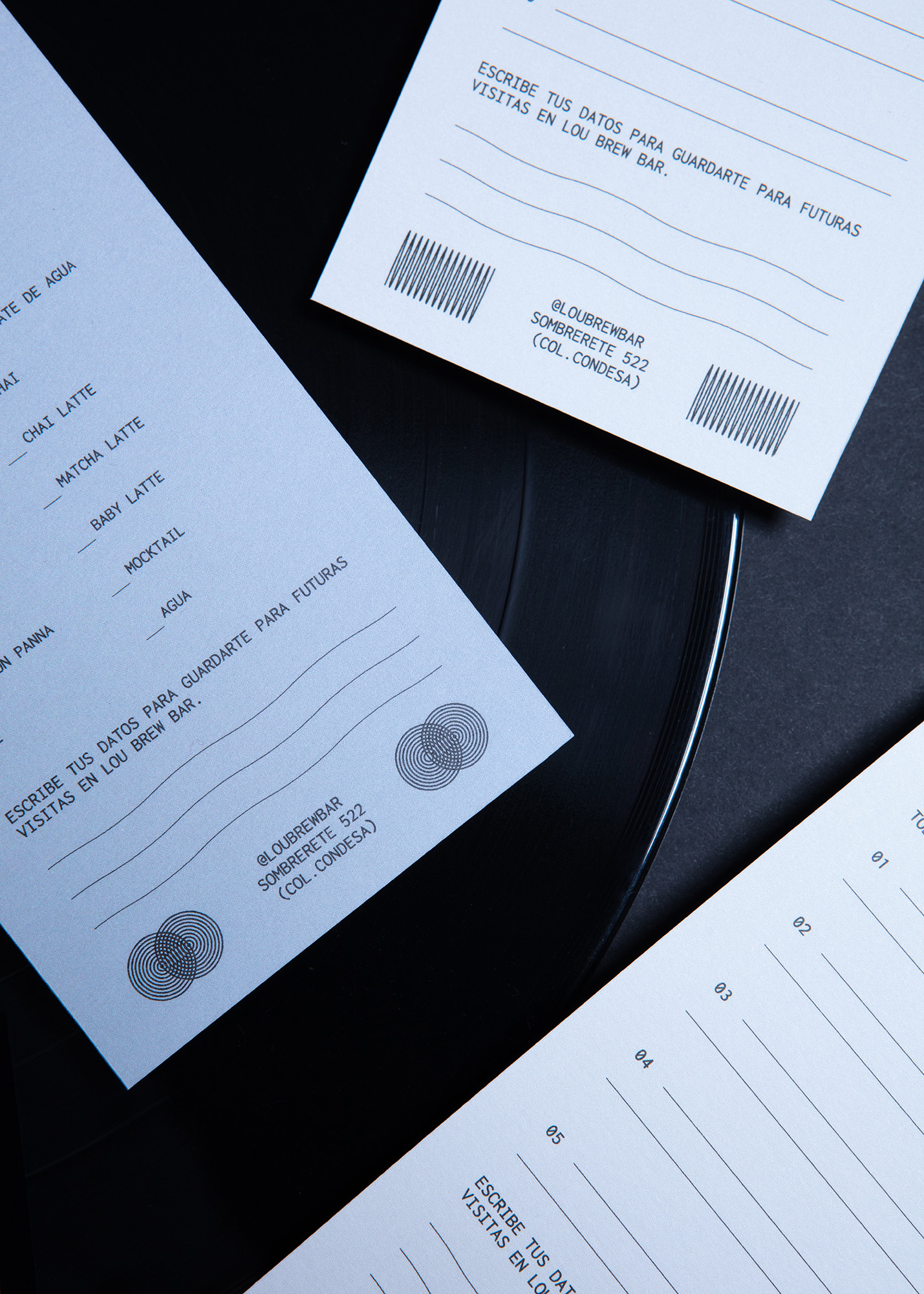
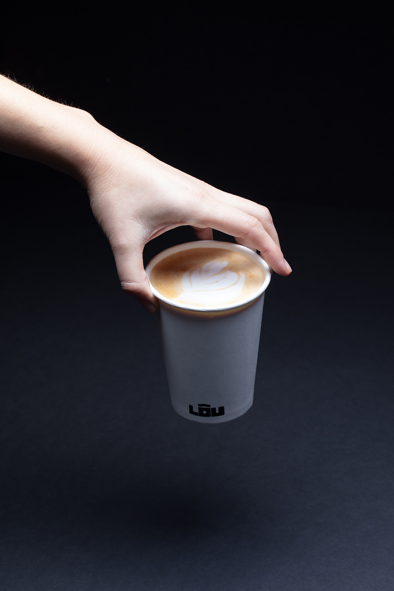
LÔU is a coffee shop in Mexico City inspired by Japanese kissaten and the “slow bar” movement. It was conceived as both a refuge and a stage, a space to discover, taste, and experience Mexican specialty coffee.
Scope:
Brand Strategy
Visual Identity
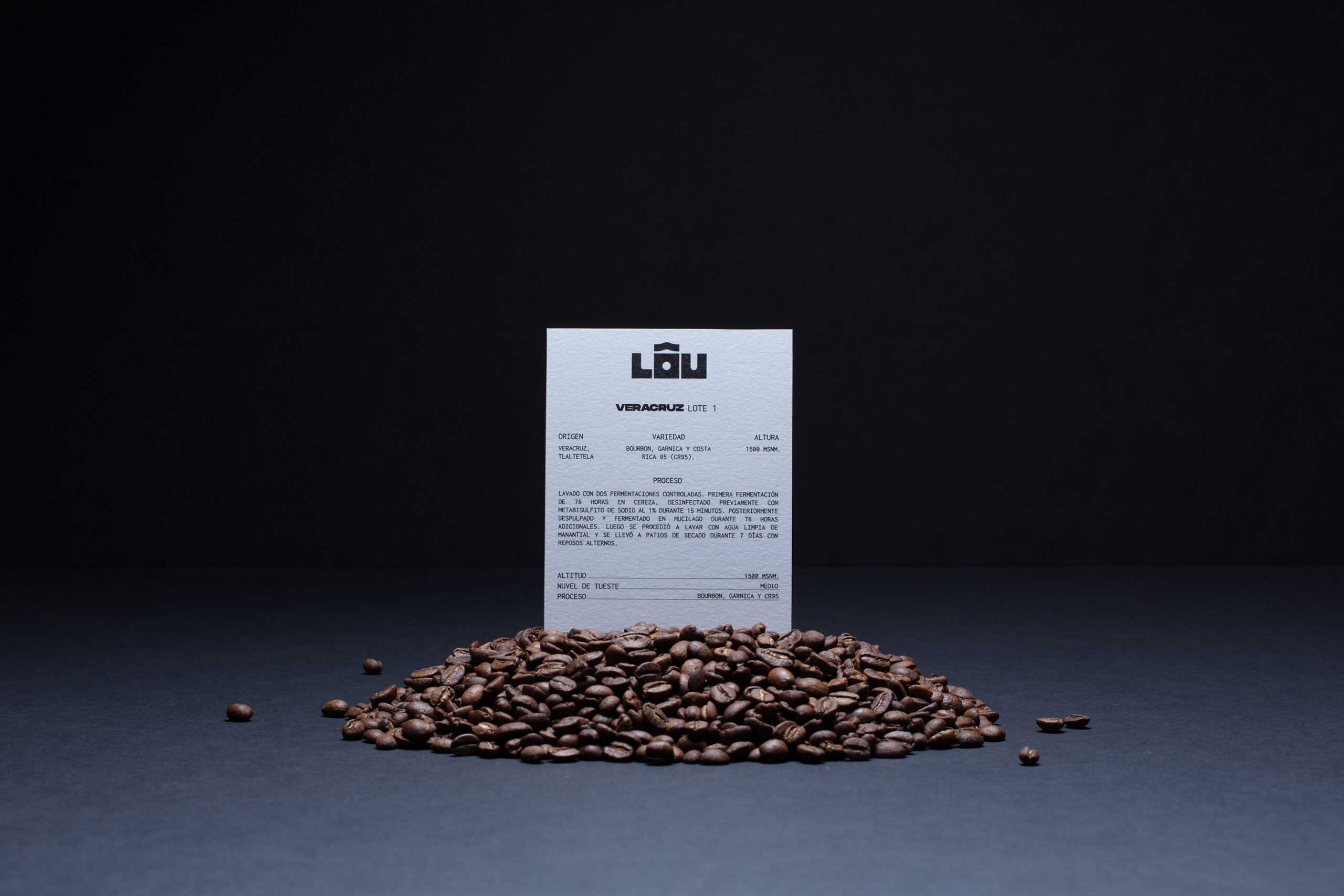
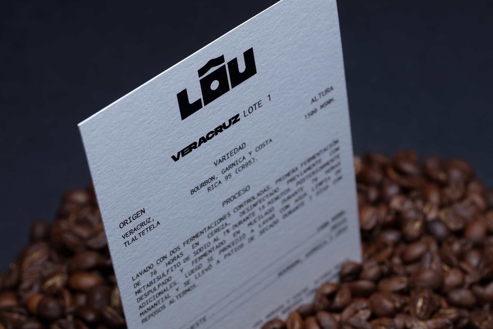
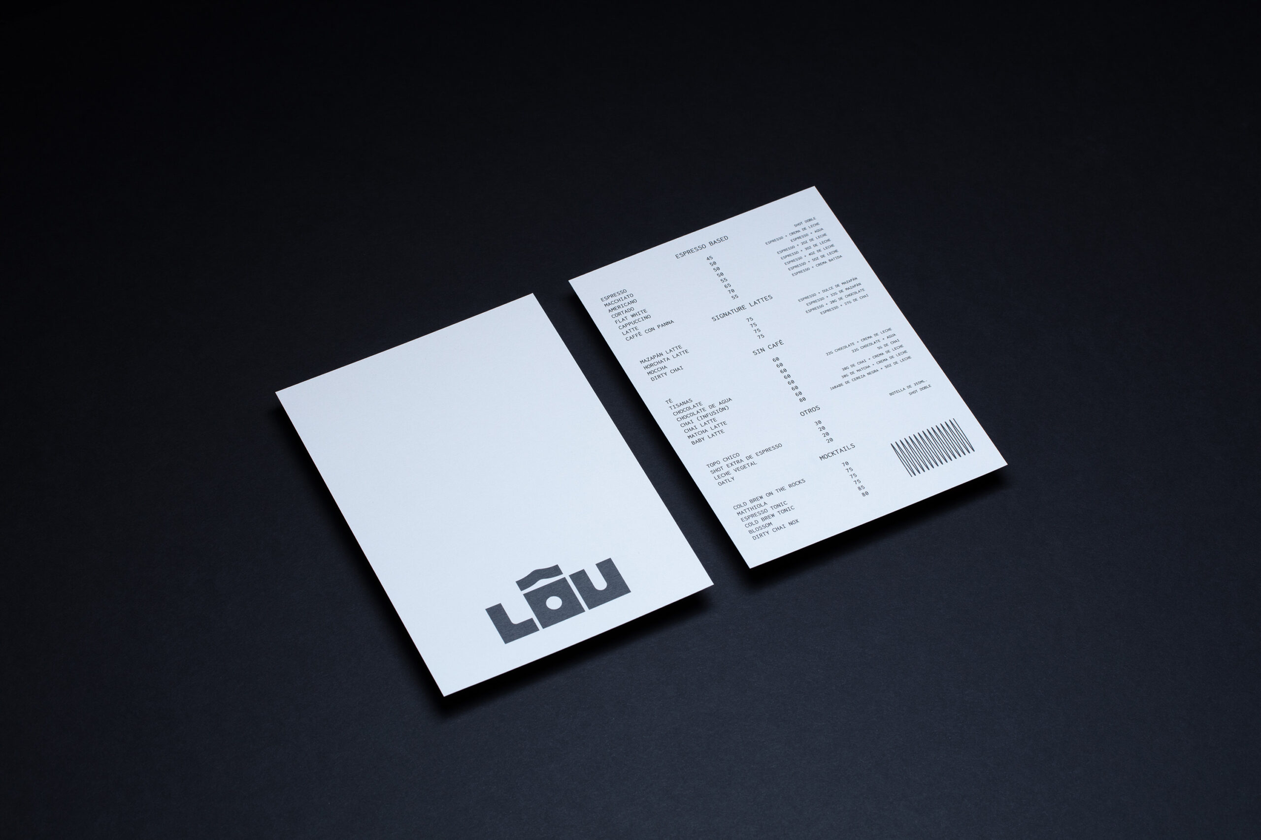
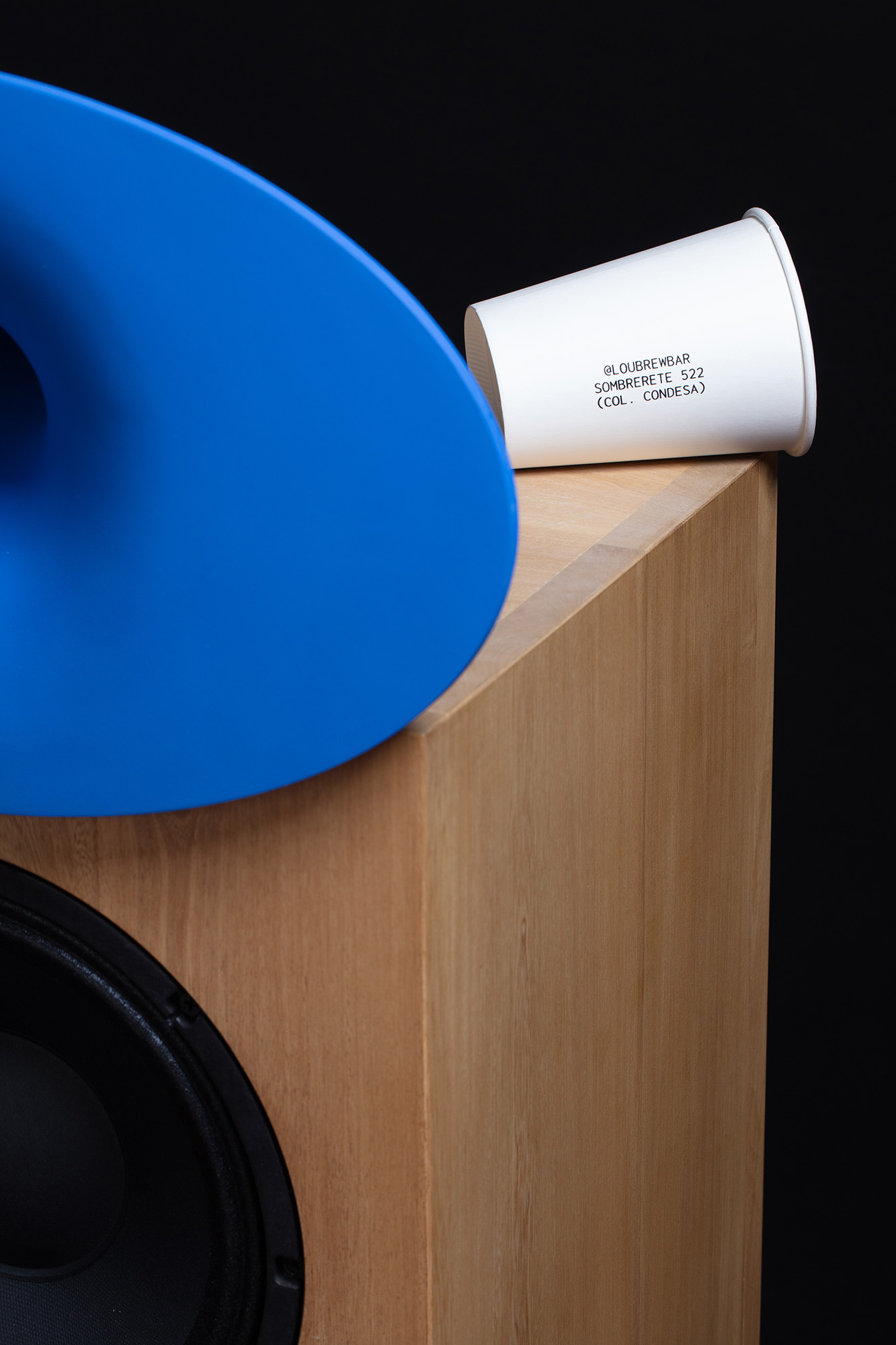
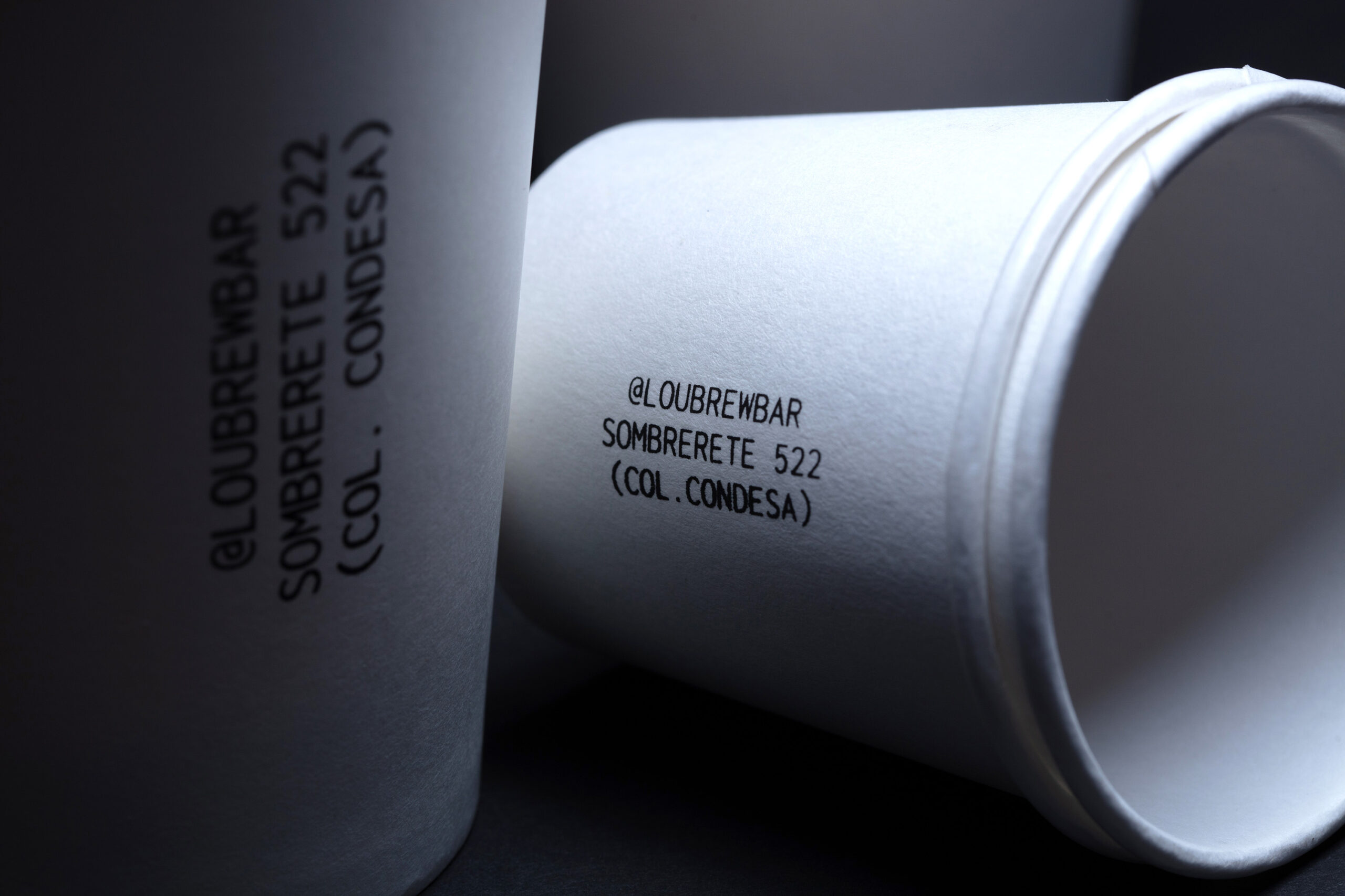
Packaging Design
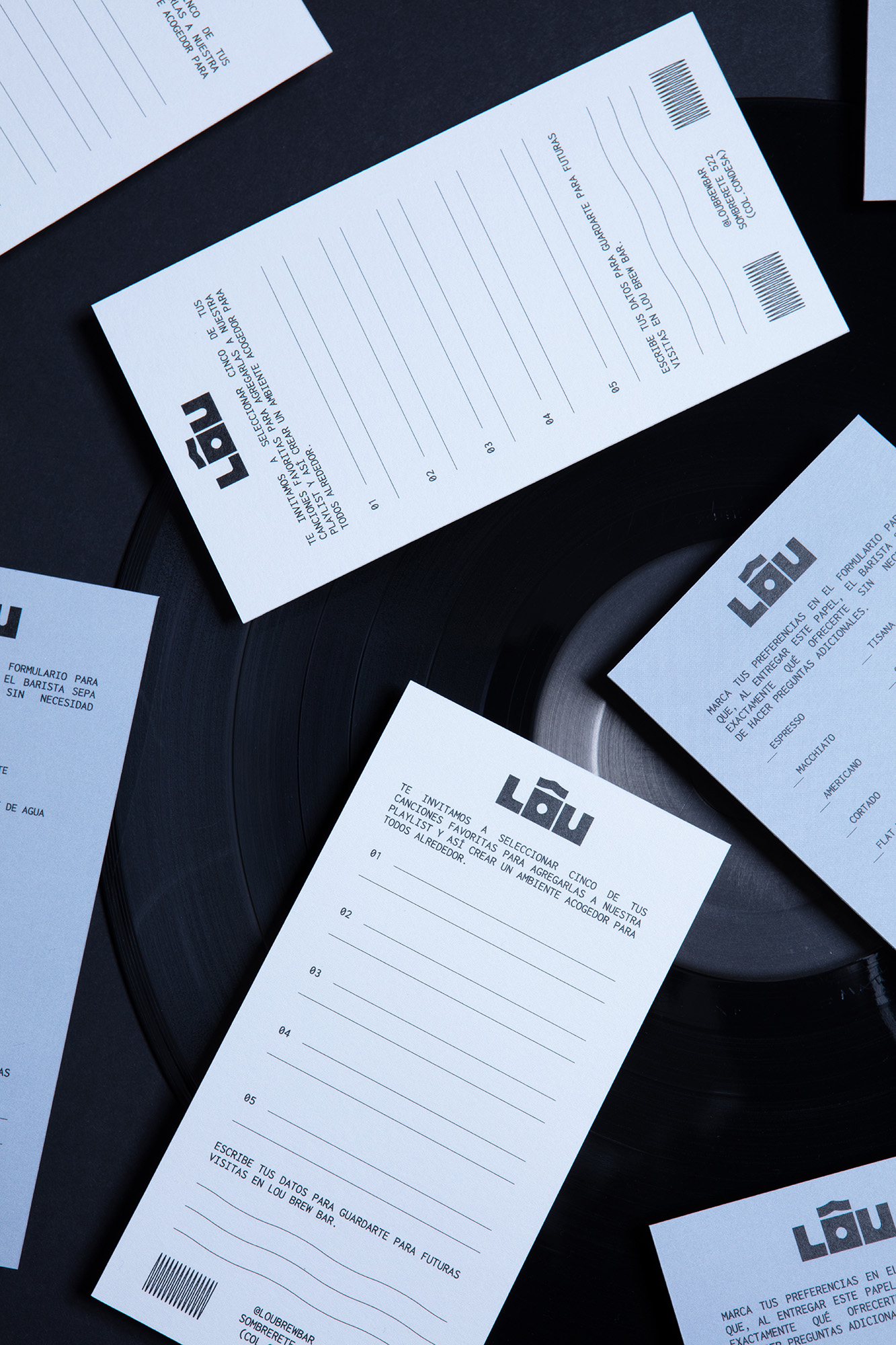
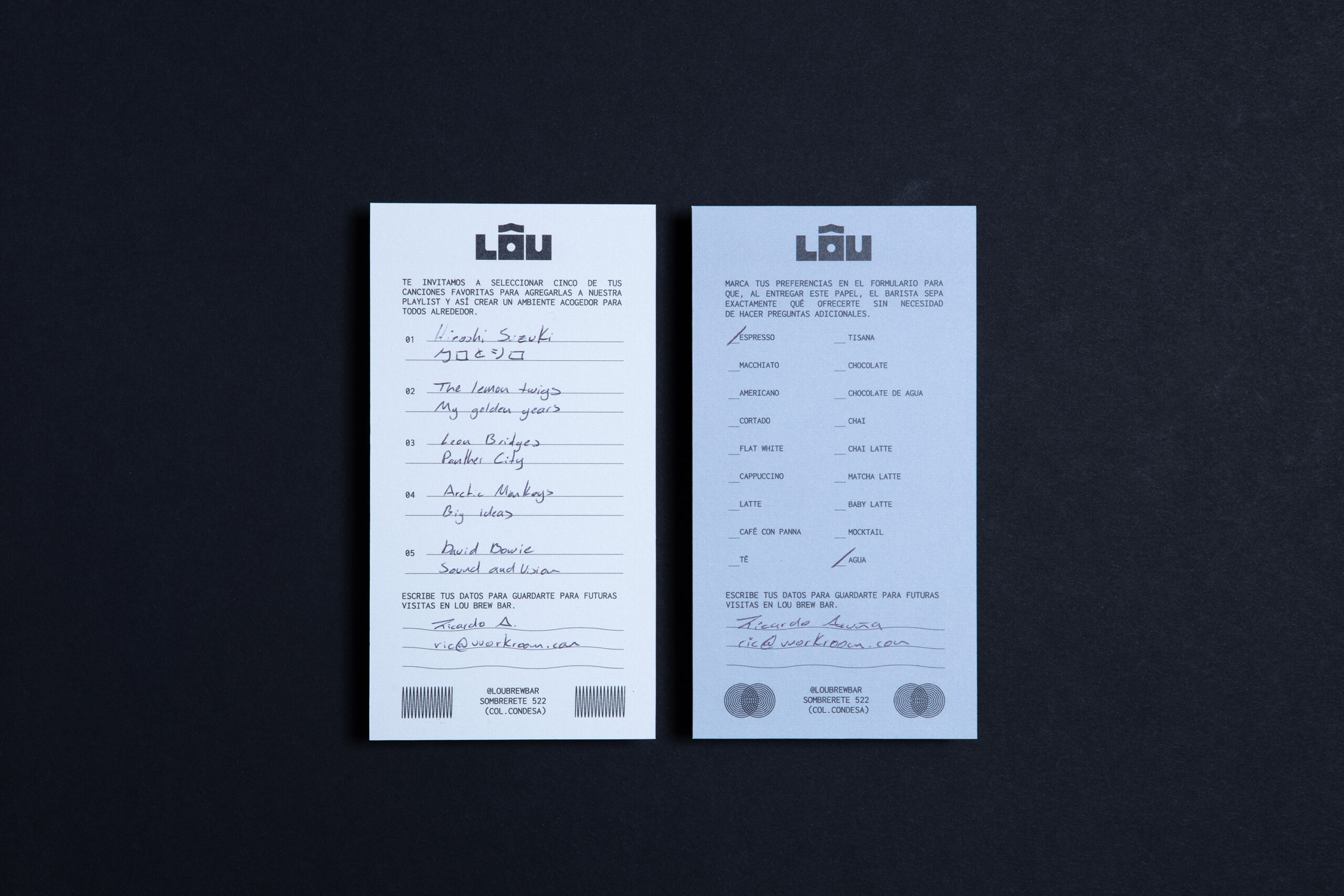
The client approached us to rebrand the café, with the request to retain key values from the original identity he had crafted when LÔU first opened. From the start, we were excited to collaborate on a brand rooted in appreciation, an invitation to slow down, be present, and savor not only coffee but also music.
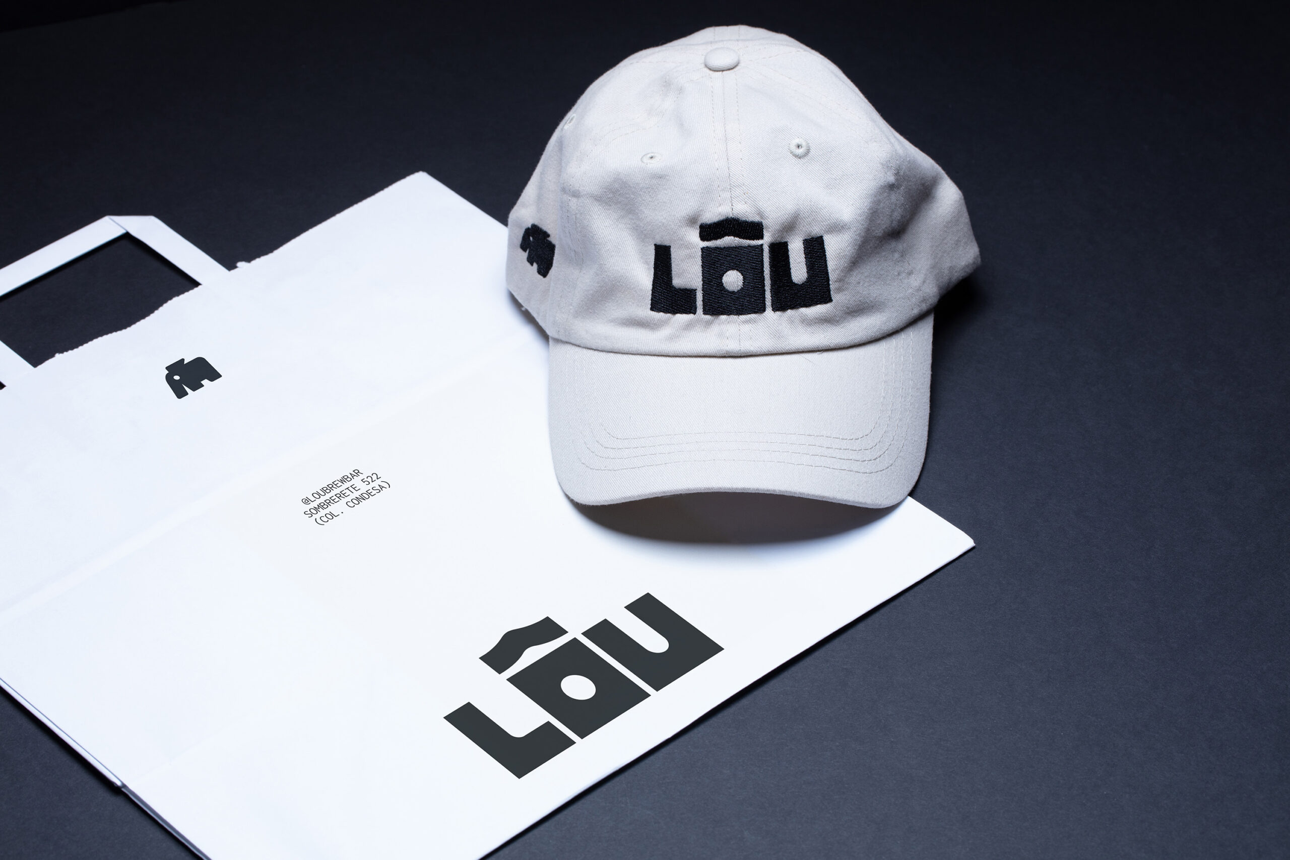
Located in the basement of a building, LÔU is intimate in scale, a quality that became central to the logo’s design.
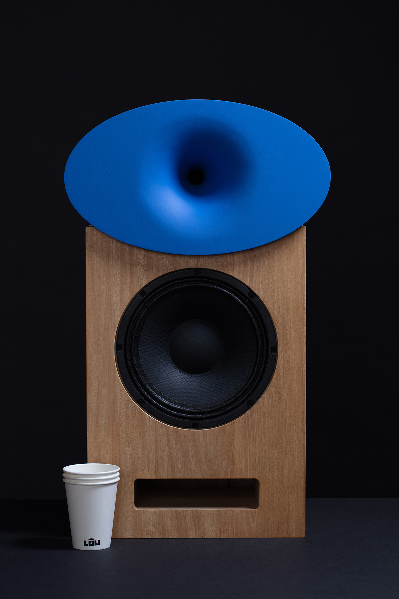
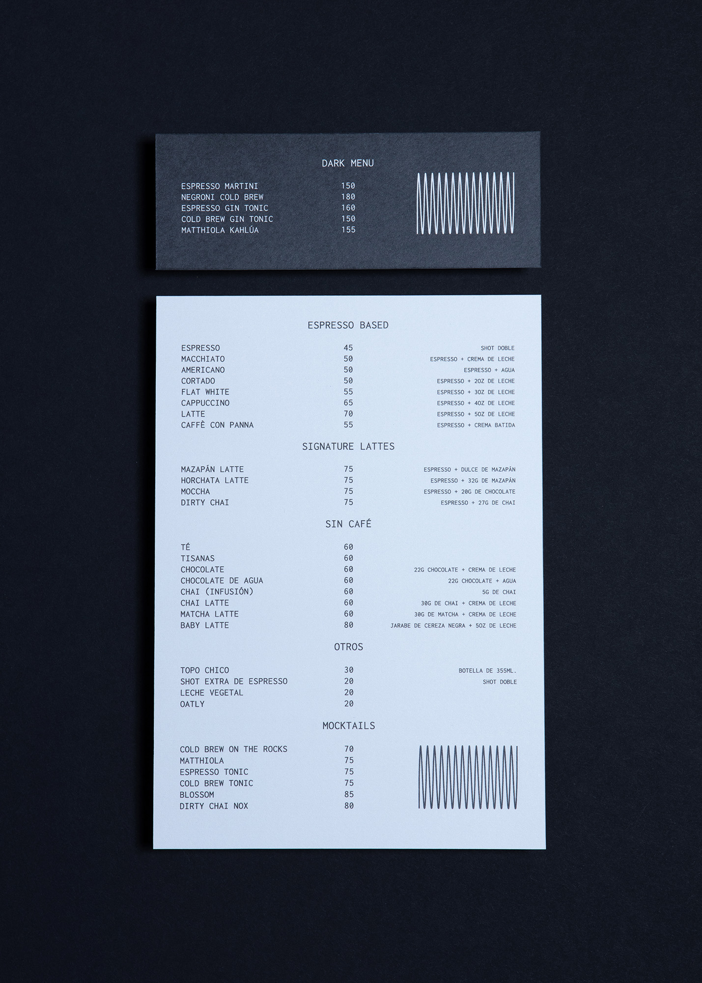
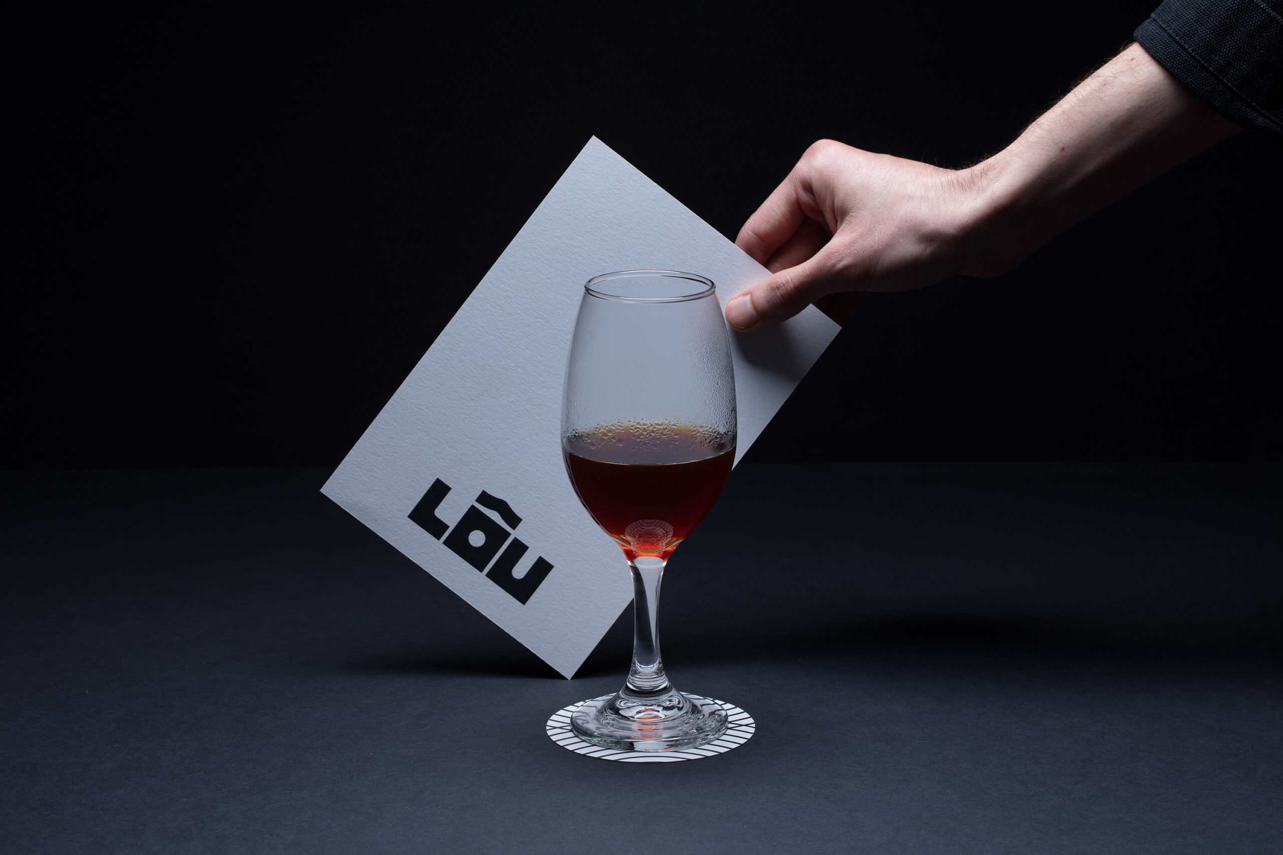
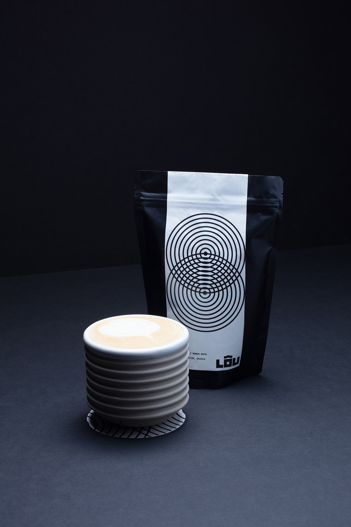
The logotype evokes the sense of a compact, underground space, drawing visual inspiration from vintage speakers found in kissaten and hi-fi listening bars, as well as the twin spouts of espresso machines.
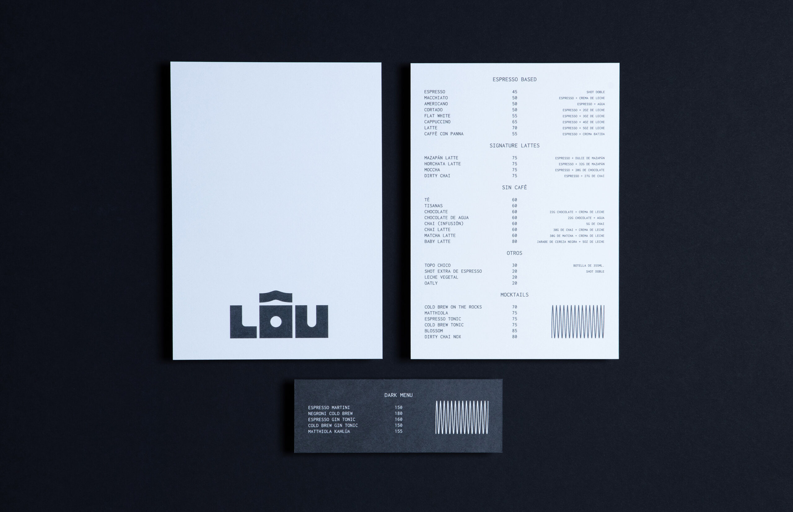
For the emblem, we worked with the image of the elephant, a symbol with personal significance to the client. Our goal was to create a form that subtly references both the shape of an elephant and the silhouette of the Victoria Arduino espresso machine used at LÔU.
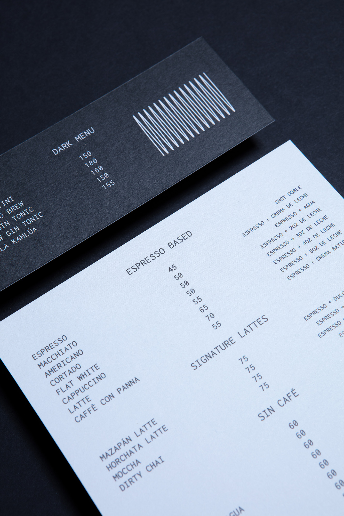
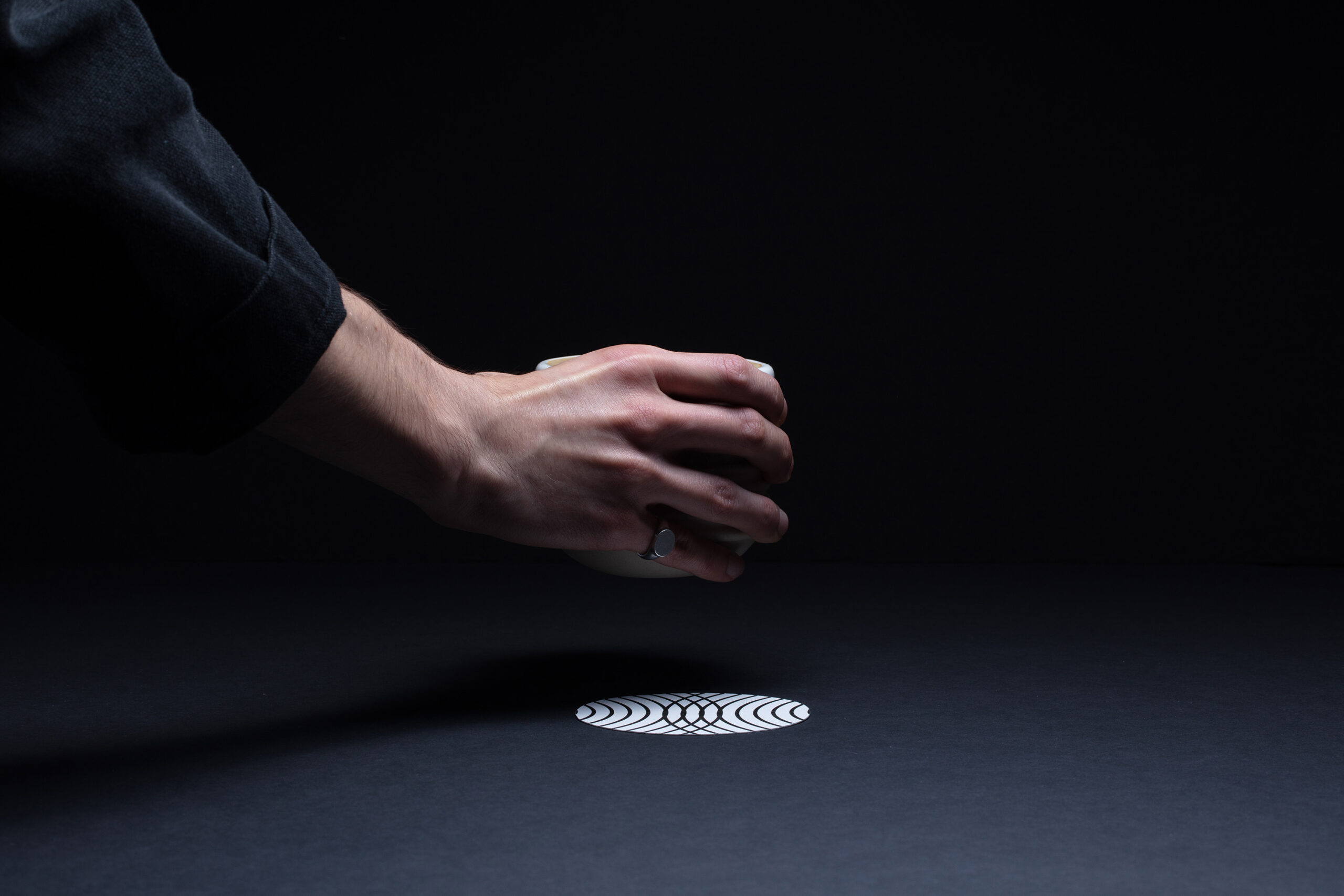
The creative direction balances high-fidelity aesthetics with a relaxed sensibility. Inspired by sound frequencies and their visual patterns, we developed a graphic language that connects music with the precise calibration of a perfect cup. The result is an identity that celebrates slowness, intention, and the quiet joy of a well-crafted ritual.

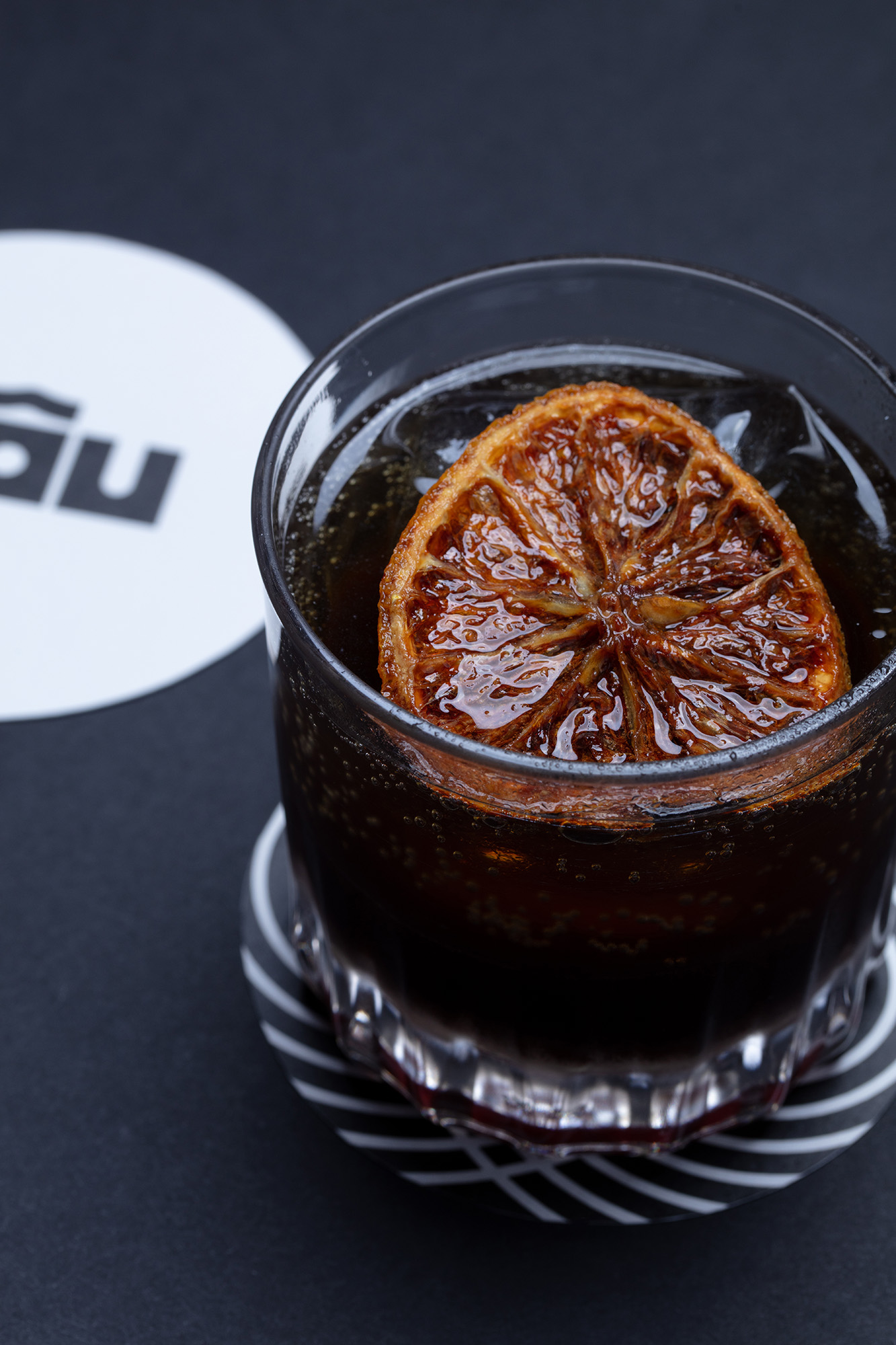
Photos by Rocket Science