Assembly
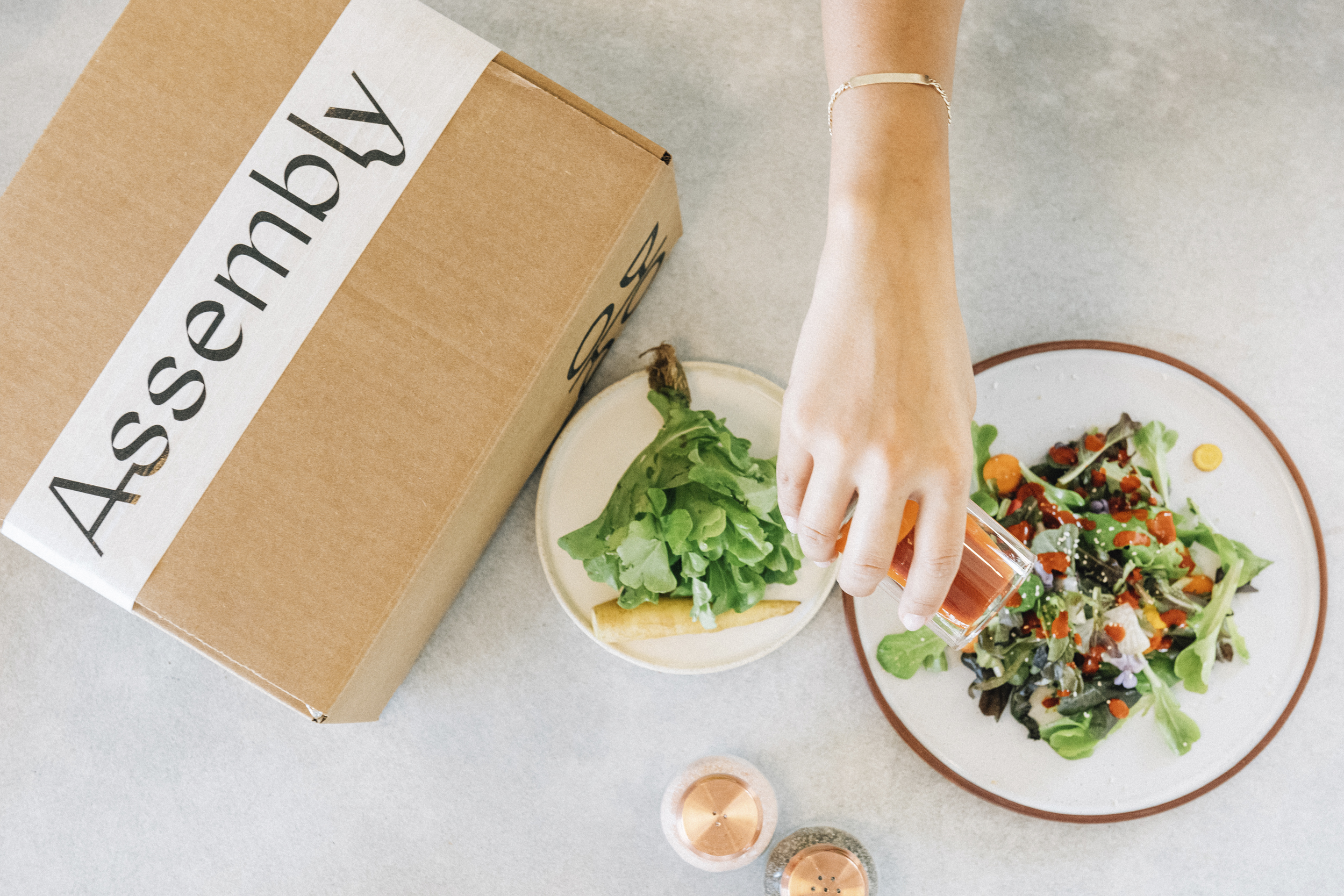
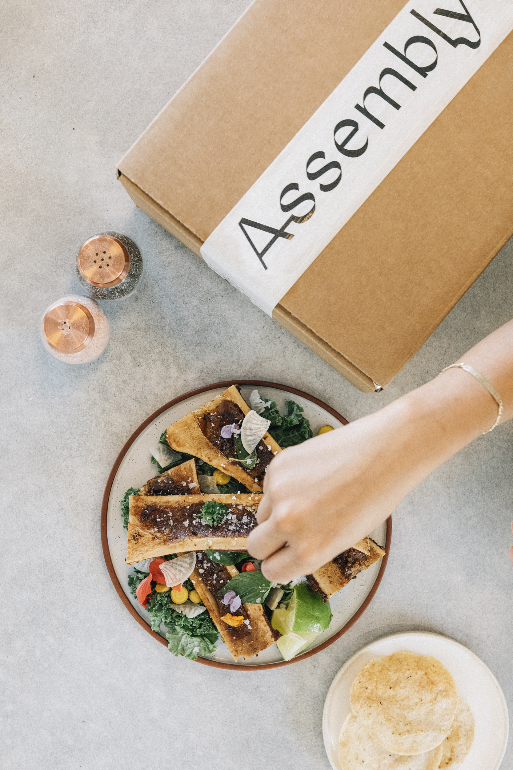
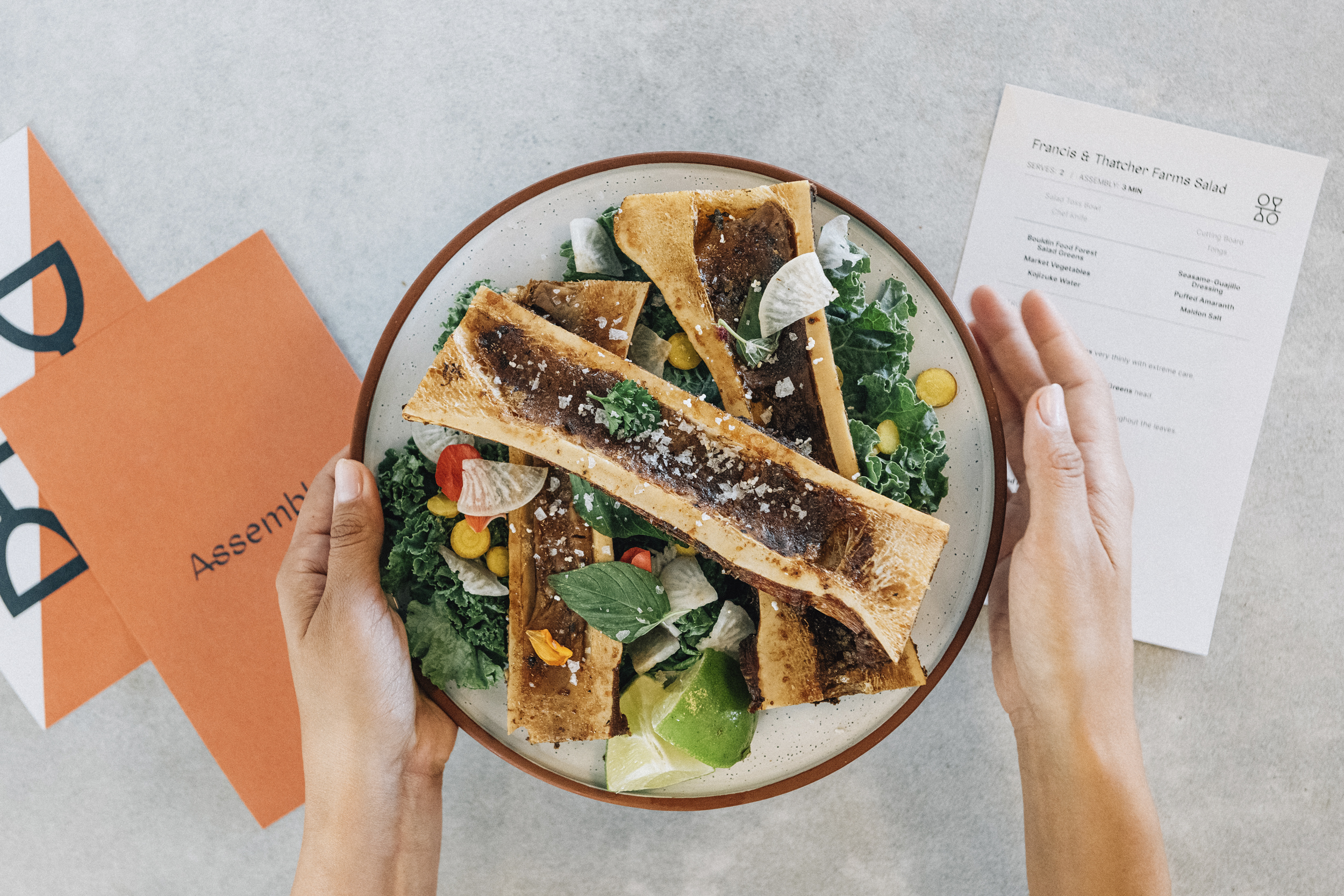
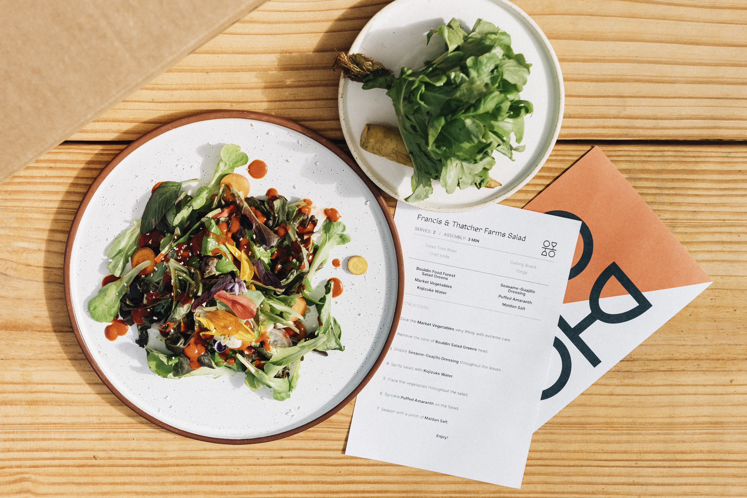
Assembly is an experience focused food and lifestyle company that delivers restaurant dishes to the home and connects people together. Their recipes are crafted by the best chefs in Austin and are delivered straight to the door.
Scope:
Brand Strategy
Naming Revision
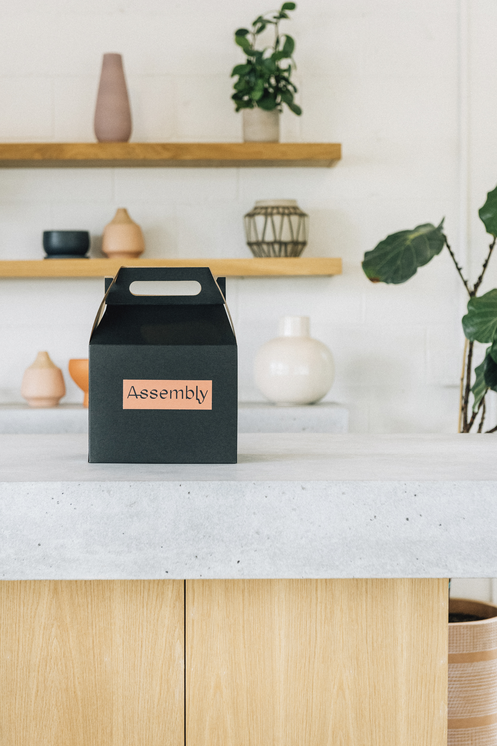
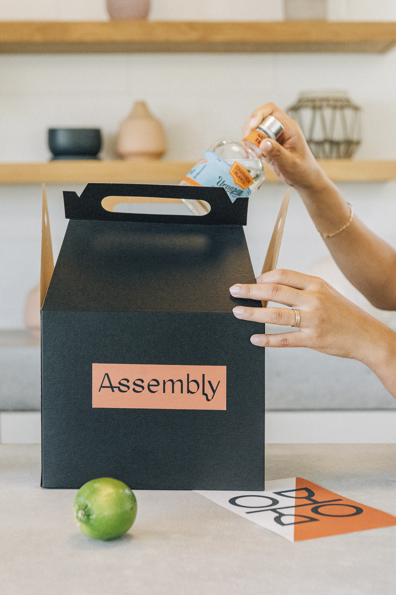
Branding
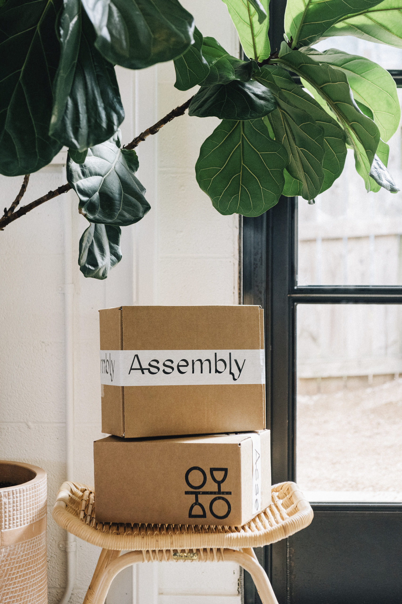
Packaging Design
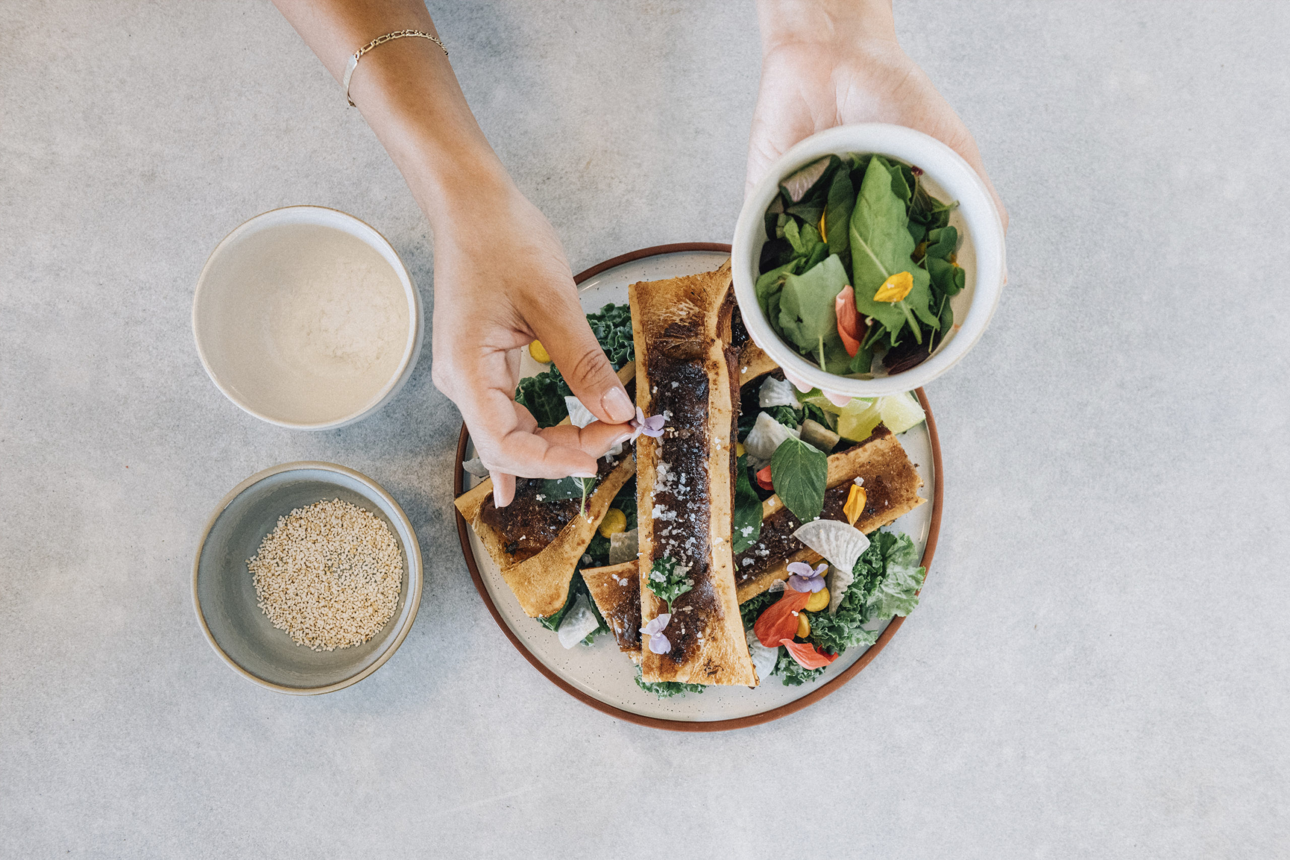
We were commissioned to create their Brand Strategy, Branding and Packaging Design. Since this project started right at the beginning of the COVID-19 crisis, it was very important for us to focus on the concept of returning joy to people by bringing them together despite the distance, even if it was online. Our goal was to create community through food. From sharing and enjoying time to creating a special atmosphere for celebration at home, setting the scene to synchronise people under the same mood.

For the strategy, we were inspired by trees as a symbol of community. There is a belief that trees communicate with each other through their roots, that when one is weak, the others transmit nutrients to revive him. This is a perfect metaphor for the Assembly community, which despite being far away, the connection they will have will be deep and meaningful.
We sought to create a logotype that would convey the brand’s idea of “Deep Connection” and the feeling of the “Burst of Joy” concept inspired by the ability of trees to communicate with each other, that is why we created the ligatures on the typeface.
The icon is an extremely simple geometric representation of a glass of wine and a dish that is reflected in front of another. This symbolized the moment of sharing exactly the same experience, the same flavors and aromas, but each in his own home. It was done in the hope that soon this could be shared at the same table.


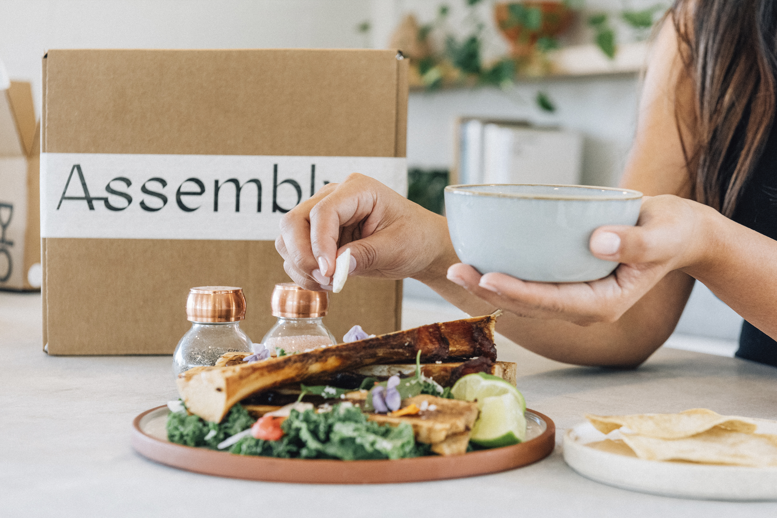

Assembly reminded us of the importance of sharing the table with our loved ones, but above all the importance of sharing quality time, even if it is at a distance.
Photos by Romp Photography