SKIN HOUSE
SKIN HOUSE is a concept that integrates and symbolizes the care of the largest human organ, the skin. A beauty center founded in 2009 by the cosmetologist María Alma Villarreal.
Scope:
Rebranding
Packaging Design
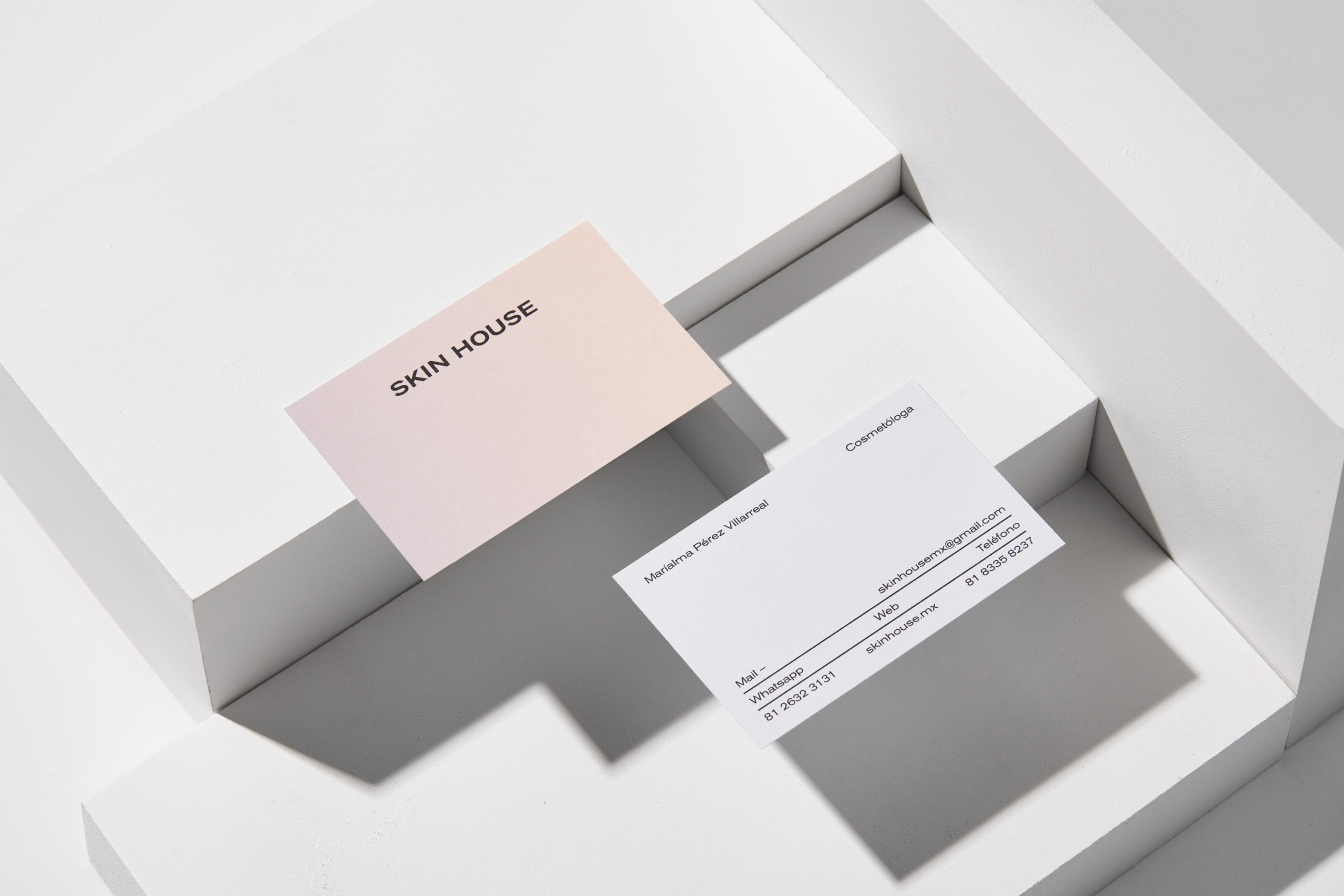
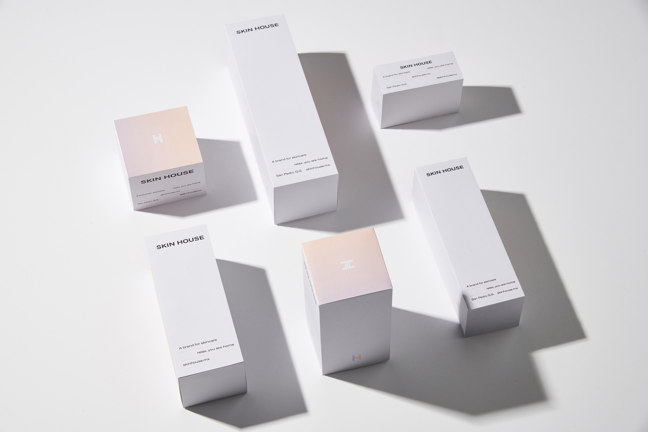
Due to their commitment to keep up with the latest trends in beauty and technology and combined with the opening of their latest branch, they entrusted us with the redesign of their complete identity.
The purpose was to create a brand that would communicate that SKIN HOUSE is not a normal beauty center, but one managed by experts and specialists trained in different parts of the world. That’s why despite using the resource of the gradient to soften the identity, the logo and emblem are very solid.
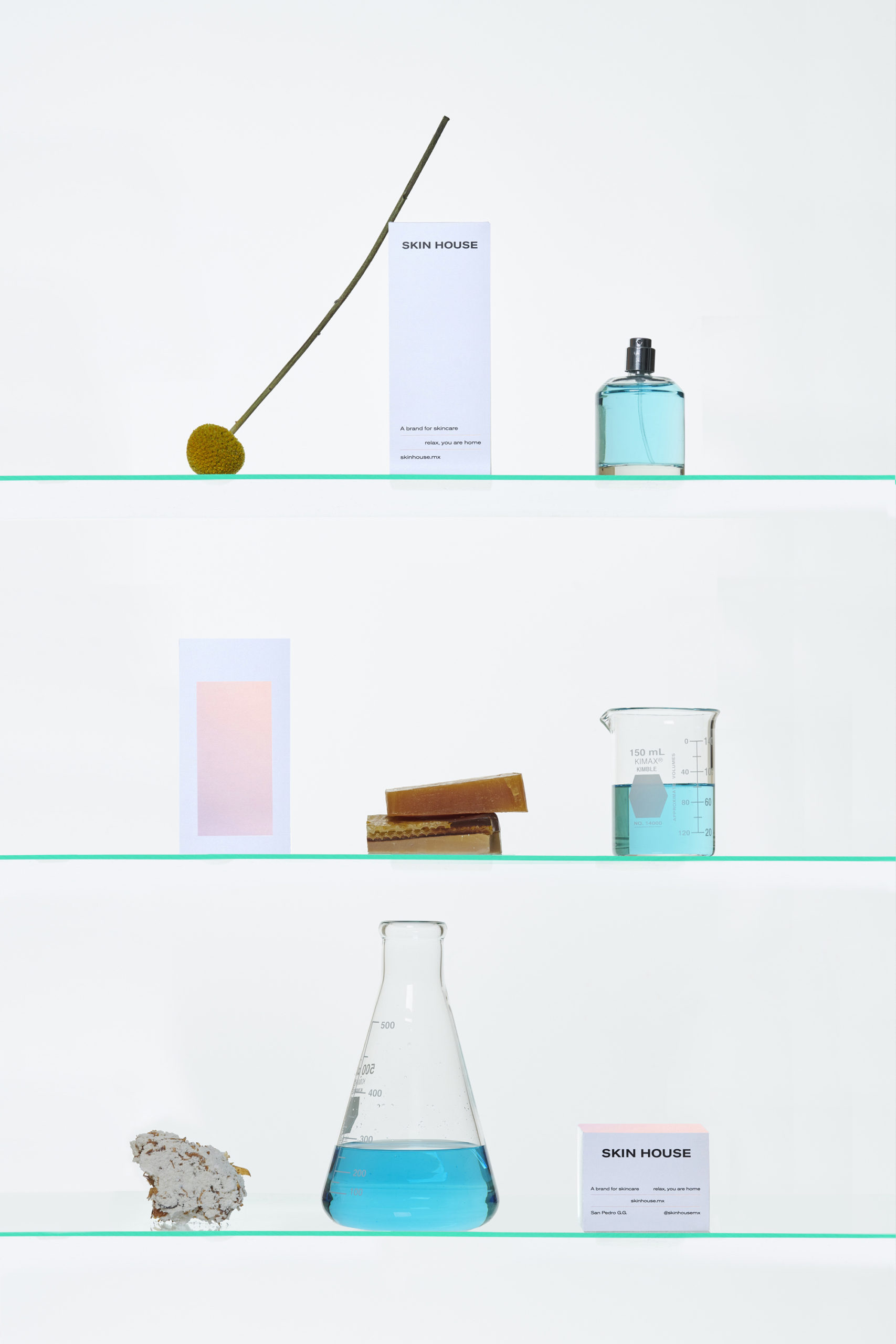
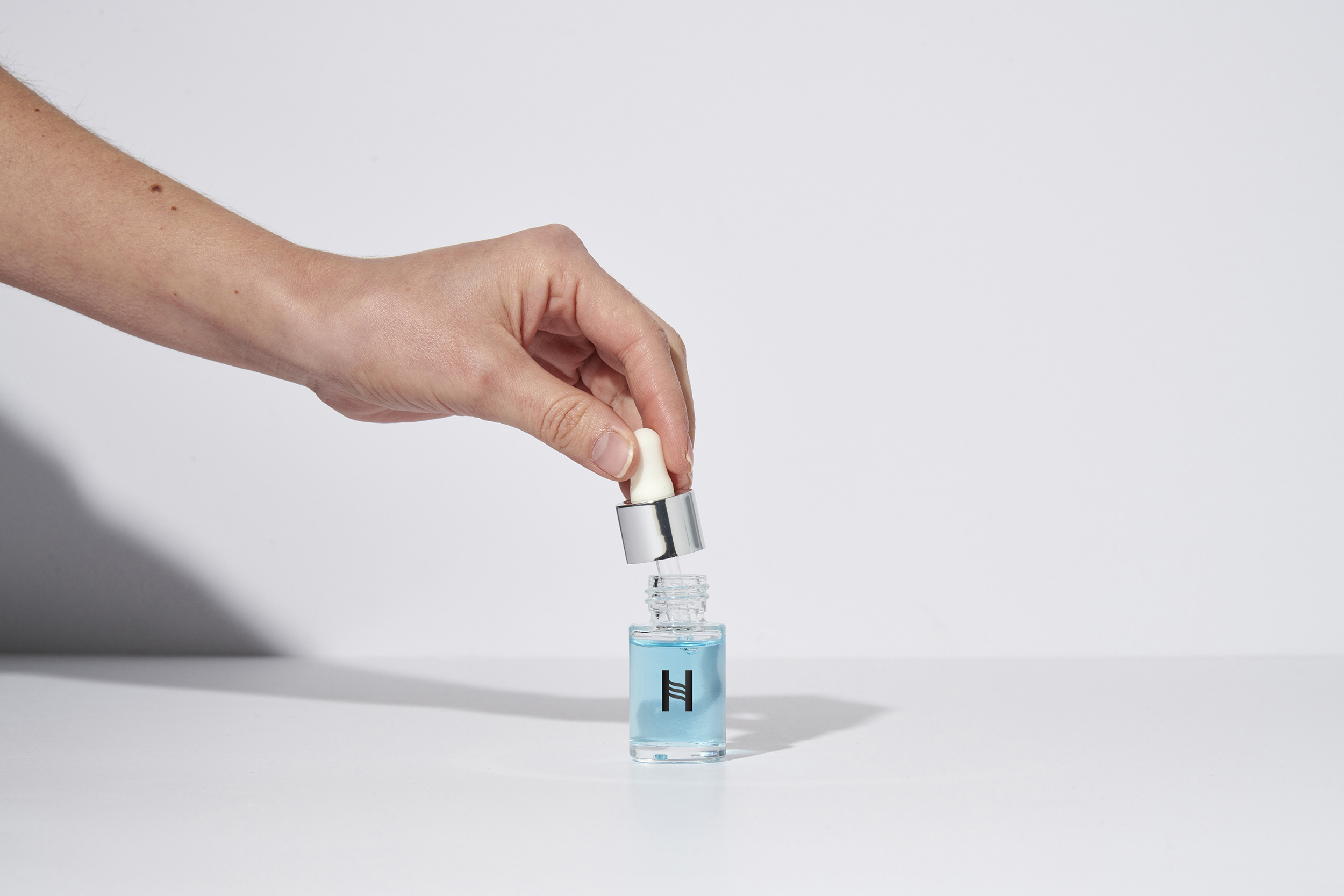
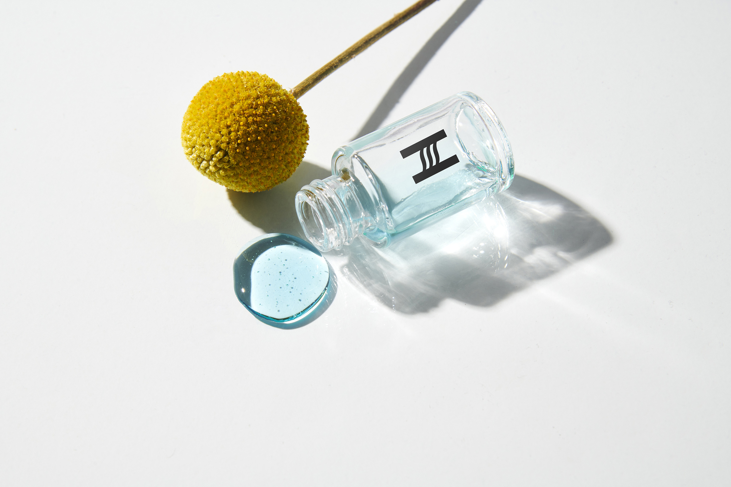
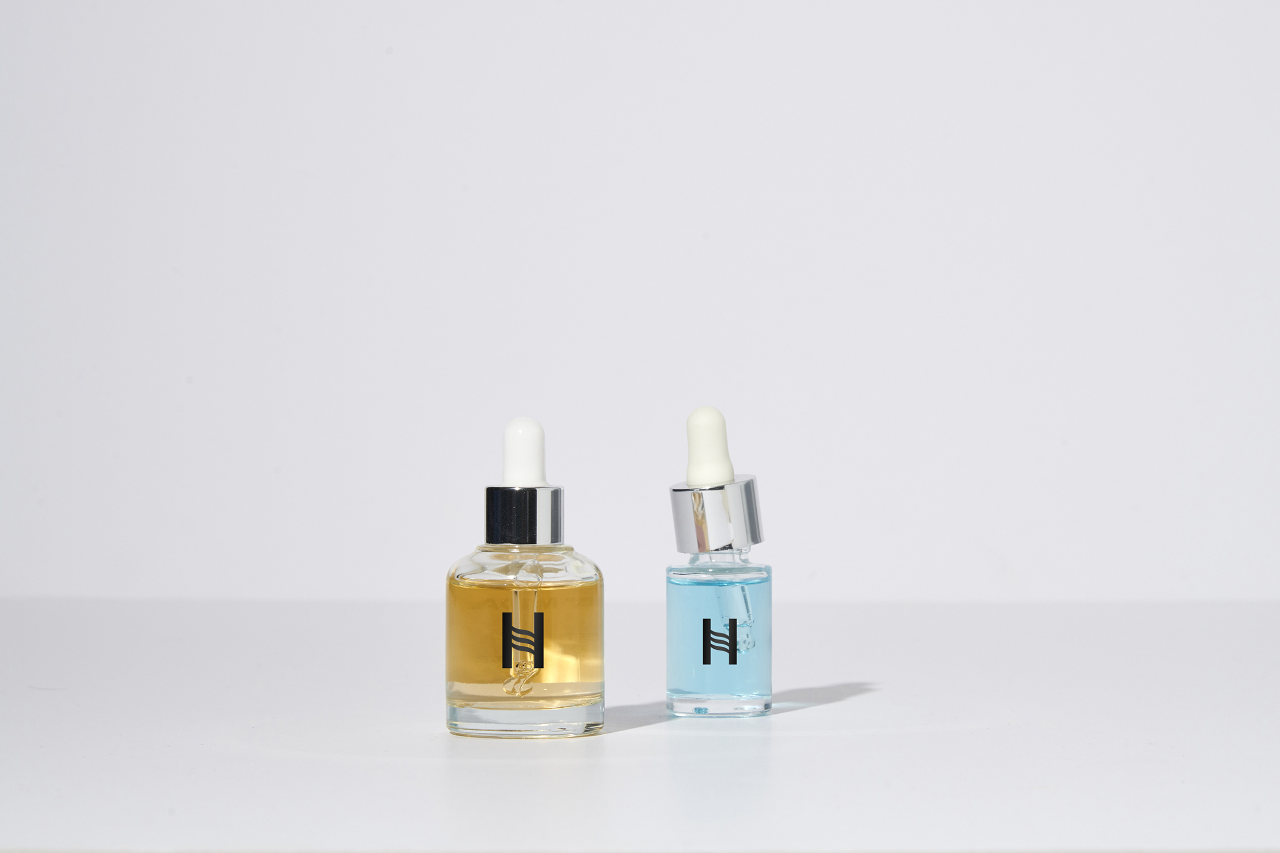
The emblem or monogram is formed by the letter H and the curvature of the S repeated three times to symbolize the 3 layers of the skin.
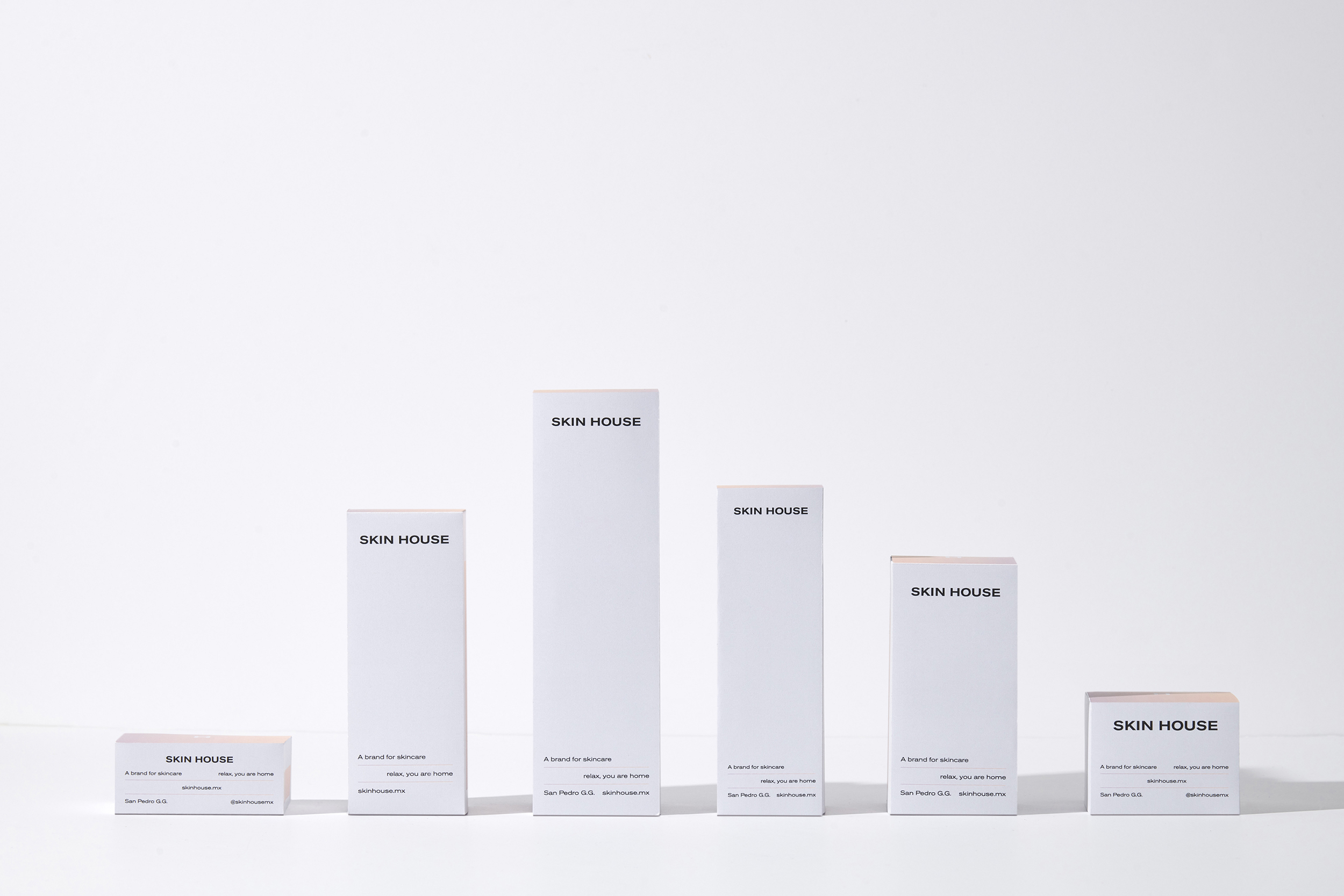
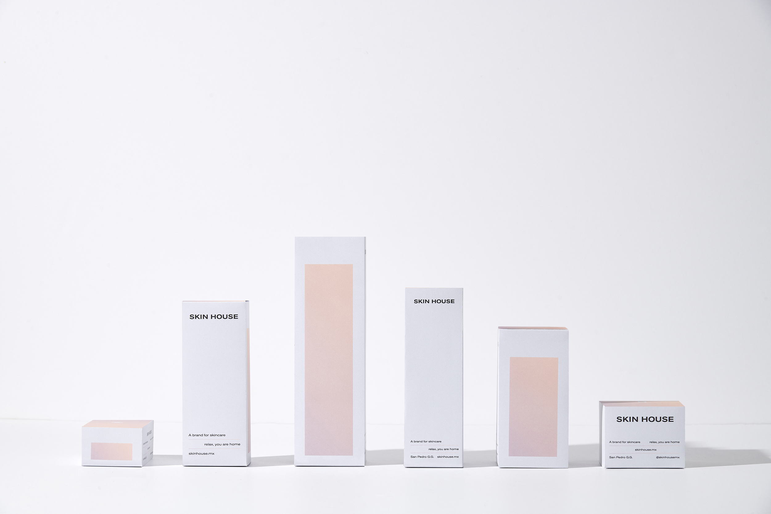
In addition to the services offered by the center, SKIN HOUSE also sells beauty products, which is why we designed a packaging system.
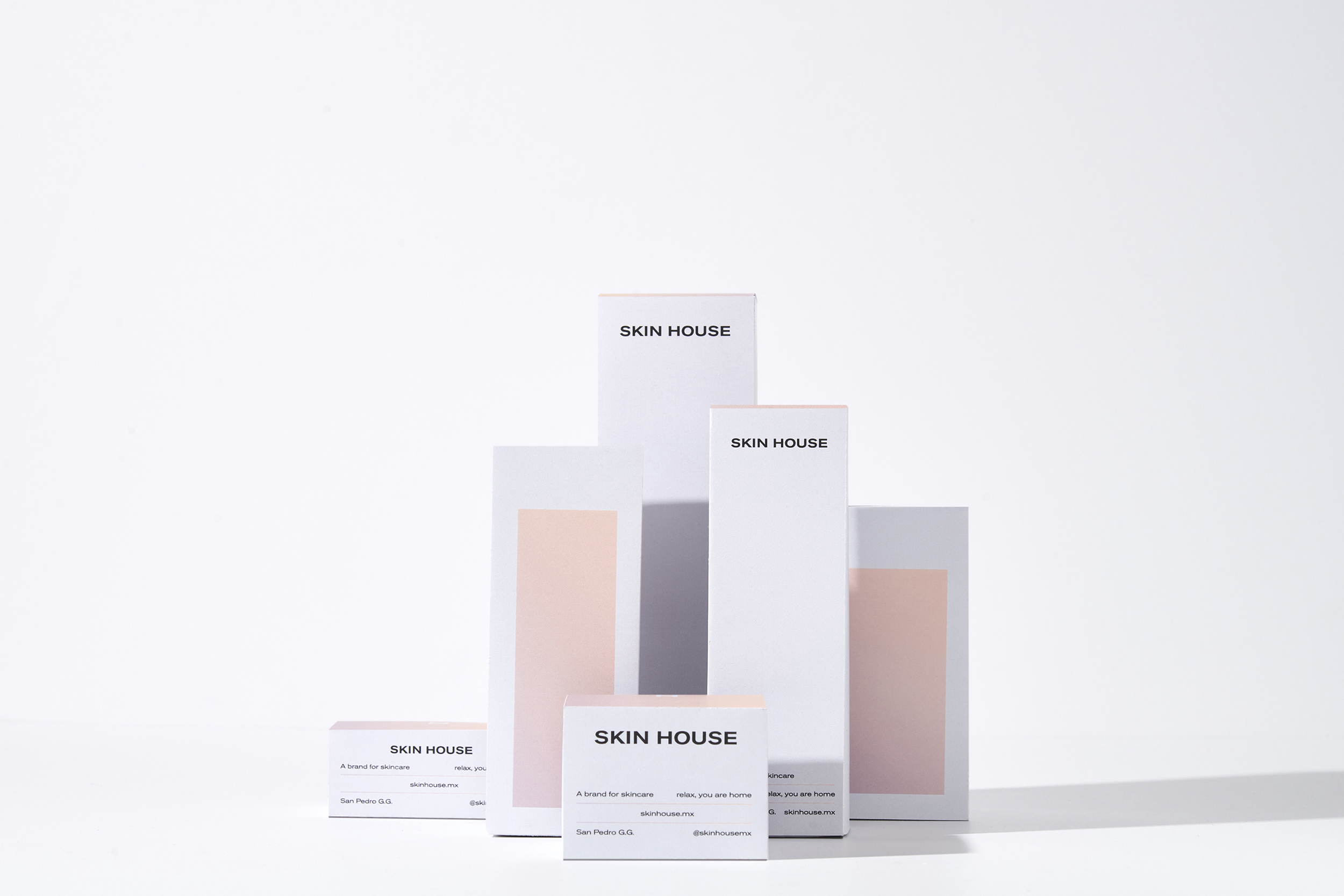
We are proud to have collaborated with a project so committed to the environment, which is being certified by the FDA, PETA and THE VEGAN SOCIETY as the first beauty center in the city of Monterrey with services and products that are 100% animal cruelty free.
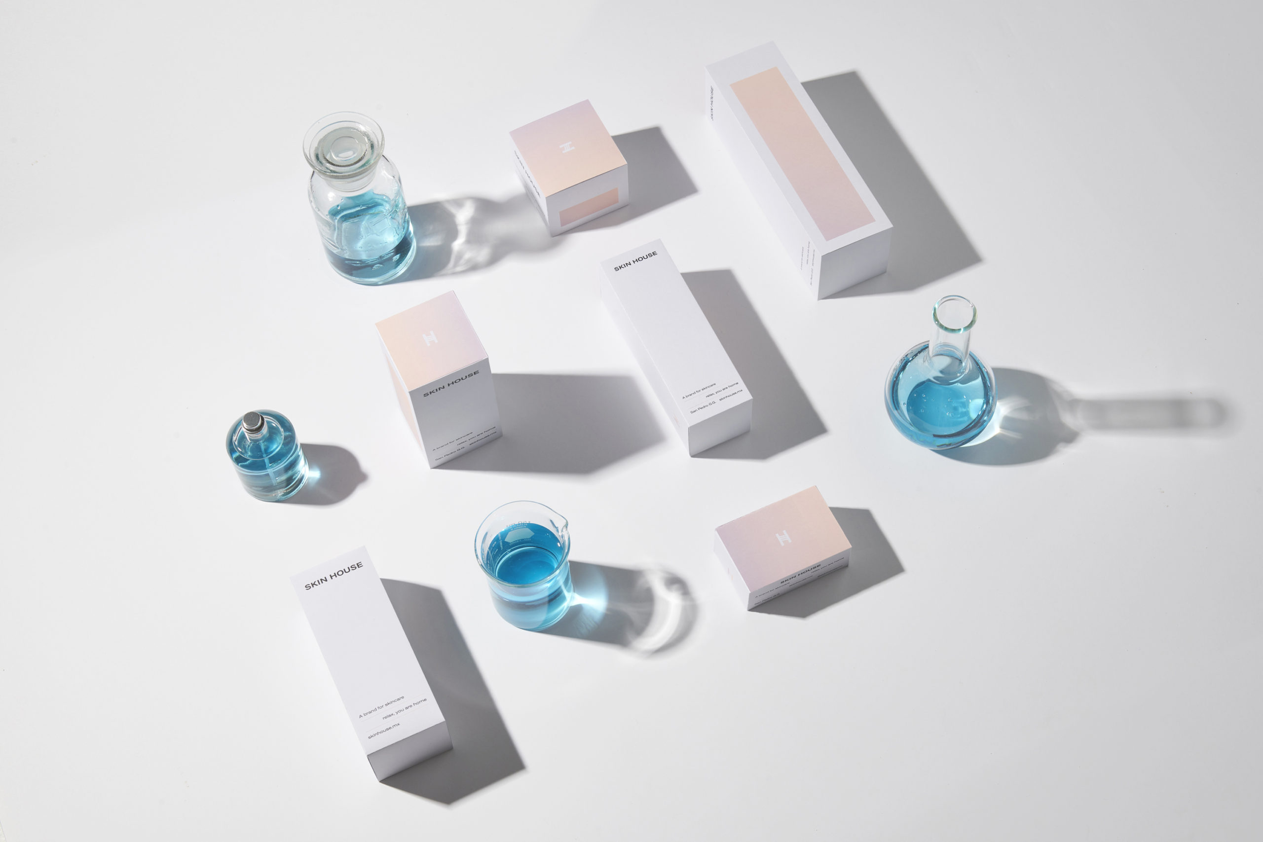
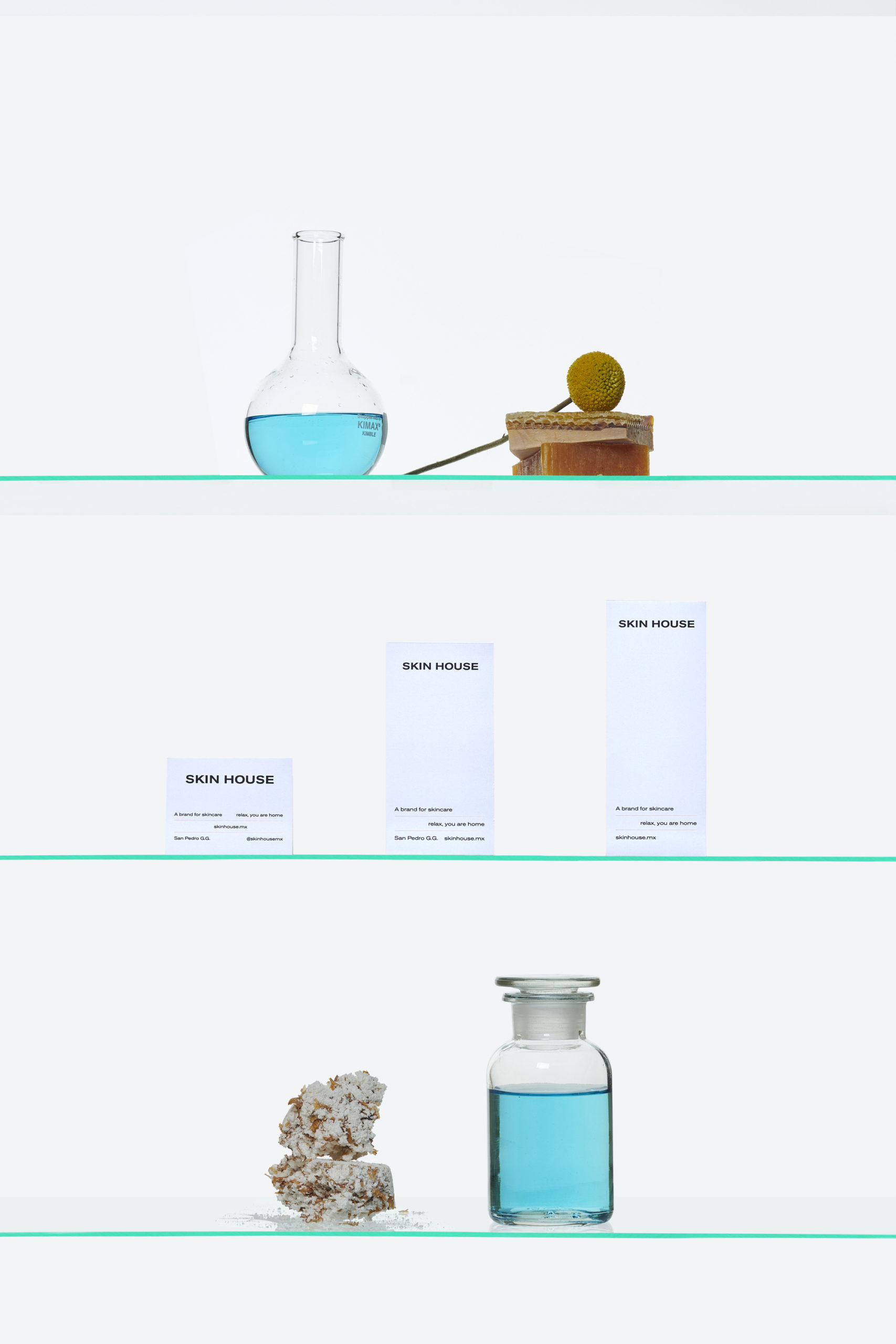

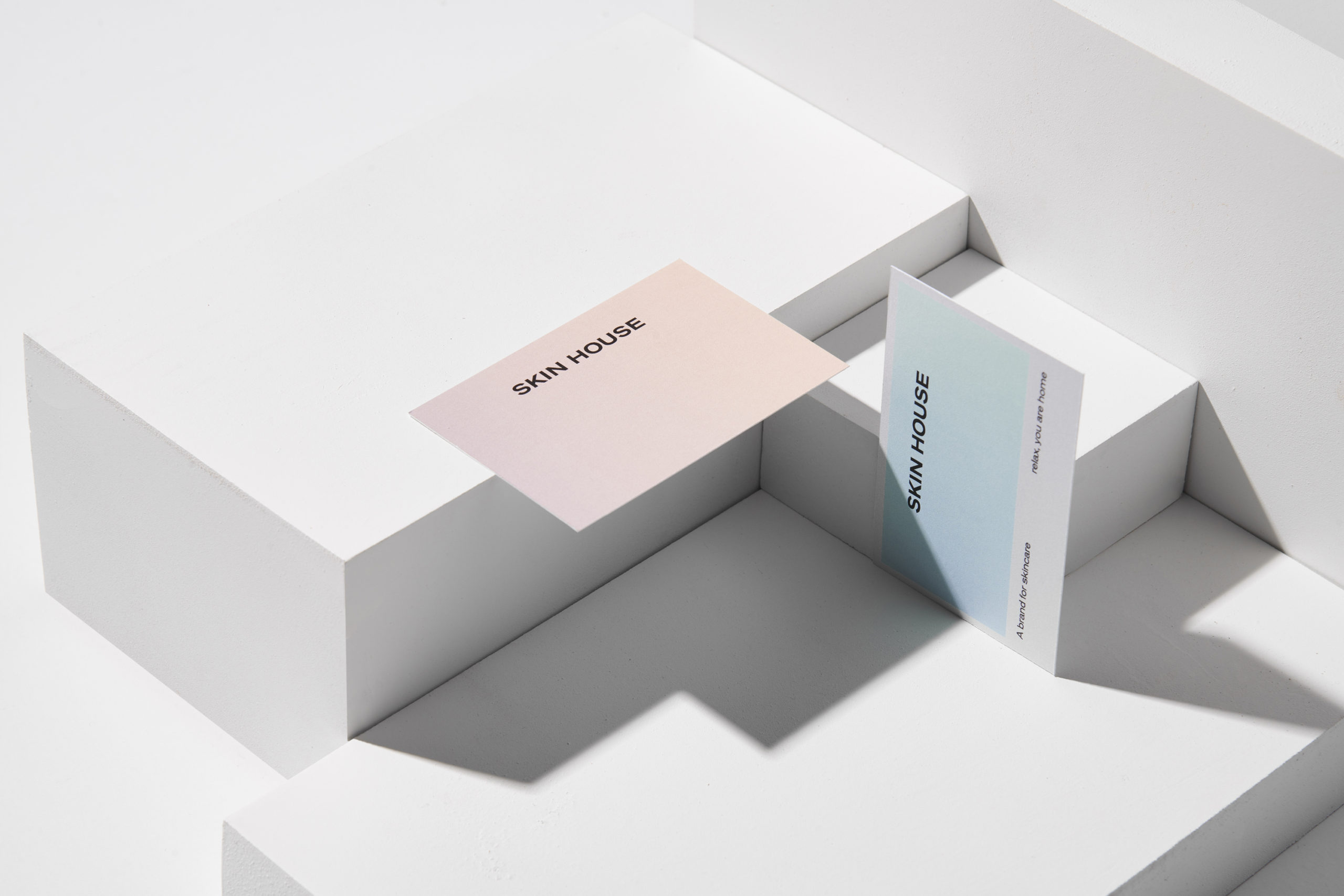
Photos by Caroga
